KPI Dashboard Excel Template: Aligning Metrics with Role, Reality, and Purpose
A KPI dashboard is only as valuable as the relevance of the indicators it displays. While Excel offers a powerful canvas for designing performance dashboards, the real artistry lies in the selection of KPIs—and more importantly, in ensuring that each metric speaks directly to a professional’s context and responsibilities.
Not every number is worth tracking. Not every trend is worth plotting. The strength of a KPI dashboard Excel template depends not on how much it can show, but on how precisely it reflects what truly matters.
kpi meaning
What is kpi mean? KPI stands for Key Performance Indicators – metrics that measures how successfully an individual, department or company achieves their key goals and objectives.
Rather than indiscriminately tracking everything, KPIs pinpoint what truly matters most. They serve as beacons through the blizzard of business data, helping leaders track progress, uncover patterns, and make adjustments when needed.
An impactful KPI is targeted to a clear aim or consequence. It can be reliably quantified using relevant records. The numbers reflect present-day results and guide choices to propel performance forward. A KPI commands attention by illuminating what actions influence outcomes.
A well-chosen KPI is:
Specific to a goal or outcome
Quantifiable using reliable data
Time-bound to reflect current performance
Actionable, meaning it leads to insights that support decisions
Context First, Metrics Second
Choosing KPIs is not about industry benchmarks or popular metrics—it’s about operational truth. A marketing lead in a creative agency views success through reach, engagement, and lead conversion. A production manager on a factory floor sees value in downtime rates, cycle efficiency, and scrap percentage. The context defines the key.
The most effective dashboards are those that begin with questions like:
What decisions do I need to make daily or weekly?
What pressures or constraints define my role?
Where do things tend to go wrong—and how can I see them coming?
A KPI dashboard built in Excel should offer answers to the real questions professionals are asking, not just colorful charts.
🛠 Crafting the Dashboard: The Role of Excel
Why Excel? Because it offers more than accessibility—it offers transparency and control. Every formula is visible, every calculation traceable. There’s no abstraction layer between the user and the logic. This makes it the ideal medium for dashboards that need to flex with changing priorities, especially in smaller teams or evolving businesses.
Excel Template Tip: Use bar charts for comparing facility performance, and line graphs to visualize downtime trends over time.
📈 Sales Manager
Revenue by Product Line
Conversion Rate
Average Deal Size
Sales Forecast vs. Actual
Excel Template Tip: Set up monthly dynamic summaries and include conditional formatting for underperformance.
🧾 Finance Analyst
Operating Margin
Cost per Acquisition
Cash Flow Variance
Return on Capital Employed (ROCE)
Excel Template Tip: Incorporate trendline analysis and leverage pivot tables to drill into cost centers.
💻 IT/Service Desk Lead
First Response Time
Resolution SLA %
Ticket Backlog Volume
System Uptime
Excel Template Tip: Combine data entry forms with KPI overviews that auto-update from logs.
📢 Marketing Specialist
Cost per Lead (CPL)
Website Traffic by Channel
Email Open Rate
Social Media Engagement Rate
Excel Template Tip: Create weekly dashboards with filters by campaign, platform, or region.
🧠 Beyond Templates: Toward Relevance
A dashboard is not a report. It’s a living tool—an interface between real work and real insight. The best KPI dashboard in Excel doesn’t try to be everything to everyone. It filters the noise and allows the user to see what truly needs attention.
Templates are helpful—but they must be contextualized. This means:
Renaming KPIs in language that matches internal goals
Updating formulas to match real workflows
Adding or removing visualizations based on usage patterns
Authenticity isn’t a design style—it’s a decision about what matters most.
So, What Is the Abstraction Behind a KPI?
A KPI is not the metric itself—it is a decision proxy. It stands in for a deeper concept, such as performance, alignment, risk, or opportunity. It’s a shortcut that helps us interpret complex systems through measurable points.
In essence, a KPI abstracts:
A goal (What are we trying to achieve?)
A process or behavior (What activity drives that goal?)
A threshold or expectation (How will we know it’s working?)
🔍 Example of KPI Abstraction
Let’s say your KPI is:
“Customer Churn Rate”
At face value, it’s just a percentage. But abstractly, it encapsulates:
Customer satisfaction
Product-market fit
Quality of onboarding
Pricing/value perception
Competitive pressure
So when churn moves, it’s not just a stat—it reflects a web of interconnected forces, filtered through one observable indicator.
🧠 Why It Matters to Understand This
If you take KPIs at surface level, you risk:
Chasing numbers without context
Ignoring underlying causes
Over-optimizing metrics that don’t reflect real outcomes
By appreciating the abstraction, you begin to ask:
What is this KPI actually pointing to?
What hidden assumptions are baked into how we define success?
Is this number aligned with the outcome we care about—or just a convenient proxy?
💡 KPIs as a Language of Strategy
Think of KPIs like words in a language. Each one represents something bigger than itself. The abstraction is the meaning, while the KPI is the symbol.
And just as in language, using KPIs well requires:
Precision (Is this the right indicator?)
Context (Does it fit the environment?)
Intent (Does it serve the decision?)
The abstraction behind a KPI is the idea it stands in for—a simplified view of success, risk, or quality. To use KPIs wisely, we must not just track them—but understand what they are really measuring, and why that matters to the work at hand.
If you’d like, I can help you map the abstract intention behind your current KPIs or visualize them in a dashboard that makes those relationships visible.
Lemmatized, Generic Formula Structures for KPIs
Creating lemmatized, generic formula structures for KPIs is about building reusable, context-agnostic expressions that can be adapted to various domains—sales, operations, marketing, finance—without hardcoding names, values, or fields.
Below is a set of generic KPI formula templates (in Excel-like pseudocode) using lemmatized KPI expressions. These formulas abstract away the exact use case and instead reflect the core logic behind the metric.
📦 1. Total Volume
Measures the total quantity of a unit (e.g., sales, tickets, outputs).
=SUM([Unit_Column])
🧠 Lemmatized Intent: Aggregate of transactional units.
💰 2. Total Value (Revenue, Spend, Cost)
Sums up financial outcomes based on unit × price.
=SUMPRODUCT([Unit_Column], [Rate_Column])
🧠 Lemmatized Intent: Output of economic exchange or consumption.
📊 3. Average per Period (Day/Week/Month)
Measures average output/value per time grouping.
=AVERAGEIFS([Metric_Column], [Date_Column], "in this Period")
🧠 Lemmatized Intent: Temporal distribution of volume/value.
🧠 Lemmatized Intent: Efficiency of resource deployment.
🧮 10. Cost per Unit
Derives the average cost of producing or acquiring one unit.
=SUM([Total_Cost]) / SUM([Units])
🧠 Lemmatized Intent: Unit economic yield.
🧠 Why Lemmatize KPI Formulas?
Portability – Apply the same formula to marketing, operations, HR, or sales.
Documentation – Helps teams understand the “why” behind each number.
Template Readiness – Easily plug into Excel dashboards or automation tools.
Model Awareness – Makes implicit assumptions explicit.
🧭 Families of KPIs & Their Common Indicators
Here’s a comprehensive and structured breakdown of kinds of KPIs grouped by family—organized by the functional domain or “KPI family” they belong to. This classification helps in selecting KPIs that are relevant, strategic, and role-specific, whether you’re building a dashboard, designing a report, or aligning team goals.
1. 🎯 Strategic KPIs
Measure overall business health and long-term direction.
Common KPIs:
Net Profit Margin
Return on Investment (ROI)
Revenue Growth Rate
Customer Lifetime Value (CLV)
Strategic Objective Achievement %
🧠 Purpose: Assess progress toward high-level business goals.
2. 💼 Operational KPIs
Focus on efficiency, productivity, and execution in day-to-day activities.
Common KPIs:
On-Time Delivery Rate
Order Fulfillment Cycle Time
Machine Downtime %
Inventory Turnover
First-Time Fix Rate
🧠 Purpose: Track how well the business is running in practice.
3. 💰 Financial KPIs
Provide insight into fiscal health, profitability, and financial risk.
Common KPIs:
Operating Margin
Cash Flow from Operations
EBITDA
Cost of Goods Sold (COGS)
Return on Assets (ROA)
🧠 Purpose: Inform budgeting, forecasting, and investment.
4. 📈 Sales KPIs
Quantify revenue generation and sales effectiveness.
Common KPIs:
Sales Revenue
Win Rate %
Average Deal Size
Pipeline Coverage Ratio
Sales per Representative
🧠 Purpose: Drive revenue outcomes and quota performance.
5. 📢 Marketing KPIs
Evaluate campaign success, brand reach, and customer acquisition.
Common KPIs:
Cost per Lead (CPL)
Conversion Rate (Website, Email, Funnel)
Return on Ad Spend (ROAS)
Engagement Rate (Social/Content)
Marketing Qualified Leads (MQLs)
🧠 Purpose: Guide campaign decisions and content strategies.
6. 🧑🤝🧑 Customer KPIs
Track satisfaction, loyalty, and support responsiveness.
Common KPIs:
Net Promoter Score (NPS)
Customer Satisfaction (CSAT)
Customer Retention Rate
Average Resolution Time
Support Ticket Volume
🧠 Purpose: Improve customer experience and service performance.
7. 🏭 Production/Manufacturing KPIs
Monitor output quality, throughput, and efficiency on the floor.
Common KPIs:
Overall Equipment Effectiveness (OEE)
Scrap Rate
Production Yield
Downtime by Cause
Units per Hour
🧠 Purpose: Optimize manufacturing performance and reduce waste.
8. 🧑💼 HR & People KPIs
Gauge workforce satisfaction, efficiency, and development.
Common KPIs:
Employee Turnover Rate
Time to Hire
Training Hours per Employee
Absenteeism Rate
Employee Engagement Index
🧠 Purpose: Enhance employee performance and retention.
9. 🌐 IT & Digital KPIs
Track service levels, system uptime, and digital performance.
Common KPIs:
First Response Time (Help Desk)
Uptime %
System Error Rate
Tickets Resolved Within SLA
Security Incident Frequency
🧠 Purpose: Maintain technical reliability and service continuity.
10. 🌿 Sustainability & ESG KPIs
Measure environmental and ethical performance.
Common KPIs:
Carbon Emissions (CO₂e)
Waste Recycled %
Energy Usage per Unit Produced
Diversity & Inclusion Metrics
ESG Compliance Rate
🧠 Purpose: Align business with social and environmental values.
✅ Summary Table of KPI Families
Family
Focus Area
Example KPI
Strategic
Vision, Growth
Net Profit Margin
Operational
Efficiency, Timeliness
On-Time Delivery
Financial
Profit, Cost, Risk
EBITDA
Sales
Revenue, Conversions
Win Rate
Marketing
Reach, Lead Generation
Cost per Lead
Customer Experience
Service, Loyalty
NPS
Manufacturing
Output, Quality
OEE
Human Resources
Workforce Metrics
Turnover Rate
IT / Digital
Systems, Response
Uptime %
Sustainability & ESG
Ethics, Environment
CO₂ Emissions per Output
Excellent request. Classifying KPIs by the type of mathematical operation they rely on helps clarify how they’re calculated and what kind of behavior they represent—volume, efficiency, ratio, trend, or deviation.
🔢 Classification of KPIs by Mathematical Operation
Below is a structured classification of KPI types by mathematical operation used to compute them.
1. 🧮 Sum-Based KPIs
Total values over time or across transactions
Math Type:SUM()
Examples:
Total Revenue
Total Units Sold
Total Operating Costs
Total Headcount
Total Energy Consumption
🧠 Represents: Volume or scale
2. ➗ Ratio-Based KPIs
Division of one metric by another to normalize performance
Return on Investment (ROI) = Net Gain / Investment
Profit Margin = Net Profit / Revenue
On-Time Delivery Rate = Deliveries On Time / Total Deliveries
🧠 Represents: Proportions, efficiency, or rates
3. 📊 Average-Based KPIs
Mean value across periods, people, or units
Math Type:AVERAGE(range)
Examples:
Average Order Value
Average Resolution Time
Average Units per Day
Average Daily Revenue
Average Cost per Unit
🧠 Represents: Typical or central tendency
4. 📈 Trend-Based KPIs
Changes over time, often expressed in percentage or absolute movement
Math Type:(Current - Previous) / Previous or time-based aggregation
Examples:
Revenue Growth Rate
Churn Rate over Time
Month-over-Month Sales Change
Traffic Trend (Week over Week)
Year-to-Date vs. Prior Year
🧠 Represents: Directional movement or performance evolution
5. 📐 Index/Rate-Based KPIs
Indexed scores or frequency calculations
Math Type: Often include scaling, weighted average, or rate formulas
Examples:
Customer Satisfaction Score (CSAT)
Employee Engagement Index
Downtime Frequency per 100 Hours
Net Promoter Score (NPS)
Defect Rate per Thousand Units
🧠 Represents: Scaled performance or frequency of an event
6. 🔄 Difference-Based KPIs
Difference between two values or states
Math Type:Value A - Value B
Examples:
Budget Variance = Actual – Budgeted
Forecast Error = Actual Sales – Forecast
Cost Savings = Previous Cost – Current Cost
Time Saved = Estimated Time – Actual Time
🧠 Represents: Gap analysis or variance tracking
7. 📅 Time-to-Based KPIs
Time elapsed between two operational points
Math Type:End Date - Start Date or Duration Function
Examples:
Time to Hire
Time to Market
Cycle Time
Lead Time
Average Response Time
🧠 Represents: Speed, efficiency, process lag
8. 📦 Count-Based KPIs
Count of discrete events or entities
Math Type:COUNTIF(), COUNTA(), or simple COUNT()
Examples:
Number of Support Tickets
Total Deliveries
Product Returns Count
New Customers Acquired
Training Sessions Held
🧠 Represents: Frequency or volume of discrete actions
Summary Table
KPI Math Type
Description
KPI Examples
Sum
Totaling numeric data
Total Revenue, Total Units
Ratio
Normalized comparison
ROI, Profit Margin, Conversion Rate
Average
Mean across entries
Avg Order Value, Avg Daily Sales
Trend
% or delta over time
Growth Rate, Churn Trend
Index / Rate
Scaled or scored performance
CSAT, NPS, Engagement Index
Difference
Gap between targets and actuals
Budget Variance, Forecast Error
Time-to
Duration from A to B
Time to Hire, Cycle Time
Count
Tally of events or records
Tickets Created, Sales Calls
🎯 Most Convenient KPI Type: Count-Based or Sum-Based
✅ Why They’re Convenient:
Simple to calculate: just tally or add values
Easy to understand: totals are intuitive
Require minimal context: works across departments (e.g., “Total Sales”, “Tickets Closed”)
Low setup effort: Excel, databases, and even paper logs can calculate them
🛠 Examples:
Total Revenue
Number of New Clients
Total Hours Worked
Support Tickets Resolved
These are often the starting point for dashboards and reports, especially in small or early-stage teams.
❗️ Most Difficult KPI Type: Ratio-Based and Trend-Based (Context-Sensitive KPIs)
❌ Why They’re Difficult:
Require contextual normalization: You need to define meaningful denominators (e.g., “per what?”)
Time-sensitive: Trends must be anchored to clean historical data
Easily misinterpreted: A good “conversion rate” for one department might be bad for another
Prone to distortion: One wrong value or gap skews ratios disproportionately
Depend on clean, consistent time stamps or sequences
🧠 Examples:
Customer Retention Rate
Return on Investment (ROI)
Average Resolution Time
Forecast Accuracy
Revenue Growth Rate (Month-over-Month)
These are strategically valuable but operationally fragile. They require good data hygiene, aligned definitions, and often domain expertise to interpret correctly.
🔁 Why This Matters in Dashboard Design
KPI Type
Ease to Build
Risk of Misuse
Business Value
Best for…
Count/Sum
🟢 Easy
🔵 Low
🟡 Medium
Operational dashboards
Averages
🟢 Easy
🟡 Medium
🟡 Medium
Productivity monitoring
Ratios/Trends
🔴 Complex
🔴 High
🟢 High
Strategic performance
Indexes/Scores
🟡 Moderate
🟡 Medium
🟢 High
Surveys, user feedback
Time-Based
🟡 Moderate
🟡 Medium
🟡 Medium
Process optimization
🔍 Conclusion
If you’re just starting out or need fast visibility: → Stick with Count and Sum KPIs.
If you’re designing for insight, benchmarking, or growth decisions: → You’ll need Ratios, Trends, and Time-Based KPIs, even though they’re harder to get right.
📊 The real skill lies in combining both types: operational simplicity + strategic intelligence.
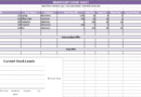
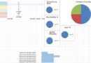
Multi-Domain KPI Dashboard Calculator – A Data-Driven Canvas
This Excel workbook is more than a collection of metrics—it’s a layered landscape of performance intelligence. Each sheet unfolds like a panel in a data triptych, revealing the lifeblood of modern operations: measurement, alignment, and action.
From Sales and Finance to Procurement, Customer Service, and IT Operations, the file presents a modular, cross-functional portrait of organizational health. KPI formulas act as the brushstrokes—precise, calculated, and strategic—drawing clarity from complexity. Color-coded cells function like guided light, subtly directing attention to significance without overwhelming the senses.
Tables embedded in each worksheet serve as the foundation of movement—living data blocks meant to evolve, expand, and trigger reaction. Each formula is more than math; it’s intention made explicit, a digital echo of the real-world questions leaders ask daily.
This piece isn’t static. It invites interaction—input, comparison, questioning. It’s a tool, but also a reflection: a mirror held up to business rhythm and resilience.
Medium: Microsoft Excel Style: Functional Abstraction with Operational Realism Palette: Clean, department-specific highlights with soft pastels to reduce cognitive friction
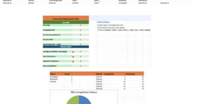
This Maintenance KPI Dashboard Excel dashboard offers a dynamic and user-friendly view of key maintenance operations. Designed for reliability teams, plant managers, and facilities engineers, it translates raw maintenance logs into actionable insights through automation and visual storytelling.
🔧 Key Features: 🗂 Data Entry Sheet – “Maintenance Log”
Excel dashboards are not about technology; they’re about clarity. In the hands of the thoughtful, a KPI dashboard Excel template becomes more than a spreadsheet—it becomes an operational compass.
When crafted with care, rooted in the realities of a role, and shaped by the questions professionals are actually asking, the dashboard ceases to be a reporting tool. It becomes a decision engine.
And that’s when it starts to deliver its real value—not just in numbers, but in confidence, alignment, and momentum.
KPI = Key Performance Indicator (self explanatory) It is quantifiable and measures the progress toward a defined goal, enabling teams or organizations to evaluate success, make informed decisions, and do better over time.
❓ Why use a KPI dashboard in Excel?
Excel is still one of the best, easiest, and most flexible ways to build your own custom dashboards. With an Excel KPI dashboard:
Live updates when data changes
Charts, table and conditional formatting for quick visual summaries
Unrestricted use of formulas, logic, and automation
❓ What makes a KPI “key”?
A KPI is “key” when:
It is a critical factor that directly drives success.
It is consistent with organisational or operational objectives
It’s actionable — that is, it gives you information to make decisions on
Not every metric is a KPI. KPIs are cultivated in order to draw the attention to what is most important.
❓ What types of KPIs can I track in Excel?
You can monitor and visualize almost any kind of KPI in Excel, such as:
Financial KPIs (Net Profit Margin, ROI)
KPIs - Store (Conversion Rate, Revenue per Rep)
HR KPIs( Time to Hire, Absenteeism Rate)
Marketing KPIs (Cost per Lead, CTR)
Logistics KPIs (Turnover Rate, Delivery On Time)
IT KPIs (Uptime %, Compliance to SLA)
❓ How to write KPI formulas in Excel?
Here are the KPI formulas using standard Excel functions such as SUM(), AVERAGE(), COUNTIF(), IFERROR(), and SUMPRODUCT(). The logic of the performance measure is captured in each formula. For example:
=SUM(Revenue)/SUM(Units) → Average Revenue per Unit =Resolved_Tickets / Total_Tickets → Resolution Rate
❓ Can I adapt the KPIs to my industry?
Absolutely. Dashboards of Excel are very much customizable as well. You can:
Add new KPIs per department
Write your own equations tailored to your work process
Employ slicers, charts, and filters to visually analyze your data
The templates cover the structure – you supply the relevance.
❓ KPI Dashboard Best Practices
Use simple, clear visuals (bar, line, donut charts)
Color-code thresholds (e.g., below target in red, above in green)
Display the only most important KPIs
Divide by department or goal
Add a short data dictionary or description tab
A kind of KPIs you’re using (strategic, operational, customer-oriented)
In today’s fast-paced industrial and facilities management landscape, data-driven decision-making is no longer a luxury—it’s a necessity. Maintenance teams are
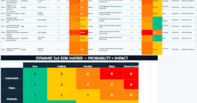
Transforming Risk Monitoring into a Structured Decision-Making Environment Advanced Dynamic Risk Register template in Excel Within most organizations, risk rarely