Stock Tracker in Excel and Google Sheet That Works
There’s something grounding about seeing your investments laid out in front of you—not buried in an app, not hidden behind four clicks, but right there, on a spreadsheet that you designed. A stock tracker in Google Sheets isn’t just a tool; it’s a window into your financial instincts, your long-term bets, and sometimes, your gut reactions to headlines.
But let’s not pretend every spreadsheet works the same. Most are bland. Some are cluttered. A few try to be everything at once and end up being nothing useful. What actually works is a sheet that feels like your own—a sheet that tracks the stocks you care about, with metrics that matter to you, in a format that feels approachable without needing a finance degree.
That’s what this tracker is about.
Built for Clarity, Not Complexity
The first time you open this stock tracker, it’s familiar. Ticker symbols on the left. Company names next to them. Then the magic begins—real-time prices update automatically. The sheet pulls in live data for current price, previous close, and calculates the change and percentage movement for you. No fiddling with formulas. It just works.
But unlike sterile finance dashboards, this tracker has personality. Alternating row colors make it easier on the eyes. Key financial points are structured in a way that makes scanning effortless. You see what’s rising, what’s falling, and what deserves a second look.
Manual Inputs Where They Matter
Not everything can (or should) be automated. The 52-week high and low? You enter those yourself—deliberately. That small act keeps you involved. It reminds you to check earnings reports, glance at charts, or read into why Tesla might be climbing or why Intel just slipped. It creates a rhythm, a small ritual of reconnection with your portfolio.
The numbers mean more when you type them in.
More Than Just Tech Stocks
This isn’t some startup-only tracker. Yes, it includes Apple, Amazon, Tesla. But it also gives space to companies like Boeing, PepsiCo, Adobe—legacy firms, consumer brands, tech innovators. You can customize it to add small caps, emerging markets, or dividend payers. This is your financial canvas.
There’s even a spot for your number of shares and total value per stock. So whether you’re managing $500 or $500,000, you always have a pulse on your portfolio’s weight.
You Don’t Need Fancy
Let’s be honest—most of us don’t need another subscription or complicated app. We need a spreadsheet that’s editable, transparent, and ours. Google Sheets gives you that. It’s easy to share, simple to update, and perfect for collaboration if you’re managing joint finances or planning with a partner.
What this tracker does is offer the freedom to build, adjust, and watch your strategy unfold, line by line.
A Tool That Grows With You
This isn’t a one-time download. It’s a framework that grows with your curiosity. Add new stocks. Track ETFs. Drop in new columns for dividend yield, RSI, or notes from quarterly calls. Use color rules to highlight opportunities or warnings. Make it bold. Make it yours.
You’ll find that once your sheet reflects your thinking, you’re not just tracking anymore—you’re learning. You’re observing patterns. You’re thinking long-term.
Absolutely—here’s a natural continuation of the article, carrying forward the same grounded tone, clarity, and humanized style:
Let the Numbers Tell a Story
There’s a moment when you stop just checking your spreadsheet and start reading it. That’s when it becomes more than a tracker—it becomes a reflection of your thinking. You begin to see not just stock performance, but your own patterns: where you took a risk, where you played it safe, where you learned something the hard way.
Maybe you notice that every time earnings season rolls around, you overreact to headlines. Or maybe you see that your best performers were the ones you forgot about—the quiet, steady growers. That kind of realization doesn’t come from an app alert. It comes from revisiting your own notes, your own sheet, your own history.
A spreadsheet, if built thoughtfully, becomes a kind of mirror.
Less Noise, More Signal
In a world full of ticker tape chaos and dopamine-fueled notifications, this tracker offers stillness. It won’t ping you when the market dips. It won’t suggest meme stocks. It won’t guess what kind of trader you are. It just sits there—patiently—waiting for you to come back, update a few rows, and reconnect with your financial map.
And in that quiet, it does something powerful: it helps you focus. No clutter. No speculation. Just data you understand, about companies you care about.
Because finance doesn’t have to feel like a casino. It can feel like gardening—planting, watching, nurturing, pruning, and harvesting over time.
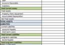
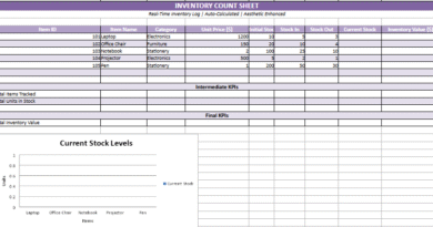
Stock Tracker Sheet
The Stock Tracker Sheet is a personalized Google Sheets-compatible template designed to help you track your investments with clarity and ease. It includes:
- 20 popular stocks with tickers and company names.
- Live updates using
GOOGLEFINANCE()for current price and previous close. - Automatic calculations for price change, % change, and total value based on shares owned.
- Manually editable fields for 52-week high and low, allowing for direct input from financial sources.
- Color-coded rows for visual clarity and readability.
- Fully customizable, so you can add more stocks, notes, or KPIs as needed.
It’s a clean, functional tool that gives you control over your portfolio’s data in a familiar spreadsheet environment.

A Shared Language, If You Want It
This tracker is also easy to share. Maybe it’s with your partner, where you both track long-term retirement goals. Maybe it’s with a college-aged sibling who’s just learning about investing. Maybe it’s with your teenager, so they can learn how Apple and PepsiCo and Netflix exist not just on their phone or in their fridge—but on the stock exchange, creating value (or not) every day.
There’s something powerful about opening a spreadsheet and saying, “Here. Let me show you how this works.”
And you don’t need to be a financial expert to do it. You just need to care. The rest builds with time.
Start Where You Are, Improve As You Go
You don’t need to wait until you understand every financial term. Start by tracking one stock. Maybe one you already own. Watch it for a week. Then add another. Then update the 52-week high when you notice a spike. Add notes. Tag important news. Before long, you’re not just tracking—you’re thinking like an investor.
And yes, you’ll mess up a formula here and there. Maybe you’ll enter a wrong ticker or forget to update shares. That’s fine. The beauty of a spreadsheet is that it’s forgiving. You can edit. You can adapt. You can learn.
What matters most is that you begin.
This Is Yours Now
You built it. You shaped it. You made it make sense.
So don’t treat it like a finished product—treat it like a living document. Like a sketchbook. Like a training journal. Because that’s what good financial tools are—they evolve with you.
They get better with use. They become more accurate as you do. And if you give this tracker some attention, it’ll return the favor with clarity, confidence, and the occasional insight that changes how you see your money.
Control What You Can
Markets move. Prices jump. But having your own system—your own space where the numbers aren’t just data, they’re part of your decisions—gives you a sense of control that’s hard to find elsewhere.
This stock tracker isn’t revolutionary. It’s practical. That’s what makes it powerful.
And that’s why it works.
📈 What Is the 52-Week High and Low?
The 52-week high denotes the maximum price that a stock achieved within the preceding twelve months, while the 52-week low is the minimum price that the stock dropped to during that same timeframe.
🧭 Why These Metrics Matter
These boundaries provide insight into the stock’s trading range over the past year. An investor can gauge whether a stock is near its recent peak or bottom and how stable or volatile the price has been.
📊 How Traders Utilize 52-Week Highs and Lows
Trend Recognition
If a stock approaches its 52-week high, it may signal continuing momentum or strength. Conversely, proximity to the 52-week low could indicate it is underpriced—or carries greater risk.
Entry and Exit Criteria
Some base trading decisions on these levels, such as buying near the annual low under a value strategy or exiting a position near the high to lock in profits.
Risk Perspective
contextualizes fluctuations. A $5 move has different implications for a stock ranging from $90–$100 than $5–$15.
⚠️ Caveats to Consider
However, 52-week bounds merely delineate past performance, not future behavior. Just as breaching the high provides no assurance of additional gains, declining below the low doesn’t guarantee further decreases. Fundamental analysis, news, technical indicators and one’s investment philosophy hold more predictive value.
Contact me if converting this to a visual aid or integrating it within a portfolio tracker would be helpful.