Every organization operates under uncertainty. A delayed supplier, a cybersecurity incident, a compliance gap, a budget deviation, or an operational interruption can rapidly transform into a costly disruption when risks remain poorly monitored. In many companies, the issue rarely comes from the absence of data. The real difficulty emerges from fragmented visibility. Information exists across emails, meetings, spreadsheets, and isolated reports, yet decision-makers still struggle to identify priorities clearly.
That is precisely where a modern risk management dashboard in Excel becomes valuable.
Far beyond a traditional spreadsheet, a well-designed risk dashboard functions as an operational command center. It centralizes critical exposures, highlights urgent priorities, visualizes mitigation progress, and transforms abstract uncertainty into actionable intelligence.
Why Risk Management Has Become Central to Modern Organizations
Operational uncertainty has become a permanent reality for businesses of every size. Supplier instability, cybersecurity threats, regulatory pressure, project delays, financial volatility, and operational disruptions now evolve simultaneously across departments.
In this environment, risk management is no longer limited to large corporations or compliance departments. Teams increasingly need practical systems capable of identifying vulnerabilities early, prioritizing critical exposures, and monitoring corrective actions through structured dashboards and operational tools.
This guide centralizes the essential models, matrices, dashboards, templates, and methodologies used to monitor business risks more effectively inside Excel and operational management environments.
Why Risk Visibility Has Become a Strategic Priority
The business environment has changed dramatically during the last decade. Risks once considered occasional or isolated now evolve simultaneously across multiple dimensions.
Organizations now face:
cybersecurity threats,
supplier instability,
inflationary pressure,
operational disruptions,
regulatory complexity,
talent retention issues,
data governance challenges,
reputational exposure,
compliance audits,
geopolitical uncertainty.
In this environment, managing risks through fragmented reports creates operational blind spots.
The Growing Need for Centralized Monitoring
Leadership teams increasingly require consolidated systems capable of answering essential operational questions instantly:
Which risks demand immediate attention?
Which departments face the highest exposure?
Which mitigation actions remain delayed?
Which operational areas show increasing vulnerability?
Which critical risks still lack ownership?
A one-page dashboard answers these questions visually and immediately.
The Purpose of a Risk Management Dashboard
A risk dashboard simplifies decision-making by transforming scattered information into structured operational visibility.
Instead of reviewing multiple disconnected files, managers gain access to:
active risks,
probability levels,
impact severity,
criticality scores,
mitigation progress,
action ownership,
monitoring status,
strategic exposure indicators.
From Documentation to Operational Intelligence
The objective extends beyond simple documentation. The dashboard creates a dynamic operational overview capable of supporting faster and more informed decisions.
This visibility becomes particularly valuable during:
executive meetings,
project reviews,
compliance audits,
operational planning,
ISO quality processes,
procurement monitoring,
cybersecurity governance,
business continuity discussions.
Why Excel Remains a Powerful Risk Management Environment
Despite the rise of specialized software platforms, Excel continues to dominate operational monitoring across thousands of organizations.
Accessibility and Familiarity
Excel already exists inside most companies. Teams require minimal onboarding, which accelerates deployment significantly.
Flexibility Across Industries
Unlike rigid enterprise systems, Excel adapts easily to different operational environments.
A dashboard can support:
finance,
industrial maintenance,
logistics,
healthcare,
construction,
IT governance,
procurement,
compliance management,
HR operations.
Advanced Visualization Capabilities
Modern Excel dashboards support highly visual monitoring systems including:
heatmaps,
KPI cards,
conditional formatting,
exposure matrices,
progress tracking,
executive charts,
mitigation indicators.
This visual layer transforms complex datasets into readable operational intelligence.
Core Components of an Effective Risk Dashboard
An advanced dashboard generally combines several interconnected sections designed to improve visibility and prioritization.
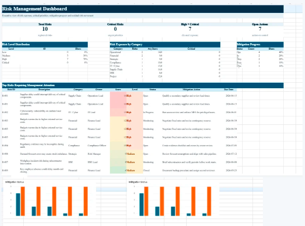
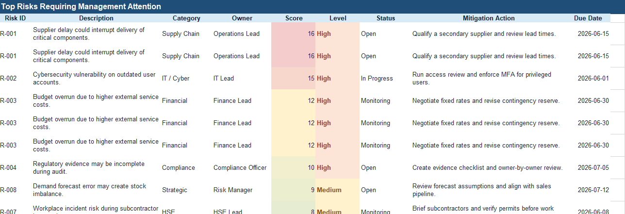
1. Risk Register
The risk register forms the operational foundation of the dashboard.
Typical fields include:
Field
Purpose
Risk ID
Unique reference
Risk Description
Nature of exposure
Probability
Likelihood of occurrence
Impact
Operational severity
Criticality Score
Risk prioritization
Owner
Responsible manager
Status
Monitoring progress
Mitigation Action
Planned response
This structure standardizes monitoring across departments.
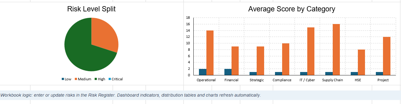
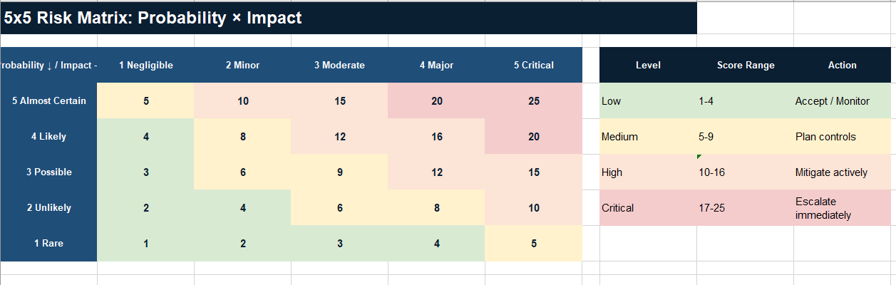
2. Criticality Matrix
The heatmap remains one of the most powerful visual tools in risk management.
It combines:
probability,
impact,
severity.
High-risk exposures become instantly visible through color-coded prioritization.
Typical Priority Logic
Green → acceptable exposure
Yellow → monitored exposure
Orange → elevated exposure
Red → critical exposure
This approach simplifies executive decision-making considerably.
3. KPI Monitoring
Modern dashboards increasingly integrate strategic indicators such as:
total active risks,
number of critical exposures,
mitigation completion rate,
overdue actions,
compliance score,
unresolved incidents,
average exposure score.
These KPIs transform operational tracking into strategic governance.
Real Operational Example
Consider a manufacturing company dependent on international suppliers.
A major supplier begins experiencing delivery instability due to transportation disruptions.
Without structured monitoring:
production schedules become unstable,
procurement loses visibility,
operational costs increase,
customer delays accumulate.
Inside the dashboard, the exposure becomes immediately visible:
Risk
Probability
Impact
Priority
Supplier Delay
High
Severe
Critical
How the Dashboard Supports Decision-Making
The dashboard also tracks:
mitigation actions,
backup suppliers,
review dates,
responsible managers,
escalation levels.
This structured visibility significantly improves responsiveness.
Risk Dashboards and Executive Governance
Executive leadership increasingly relies on visual operational intelligence rather than static reporting.
A one-page operational dashboard often provides greater value than lengthy presentations because it concentrates attention on actionable priorities.
Industries Where Risk Dashboards Deliver Strong Value
Risk management dashboards support nearly every operational sector.
Finance
Monitoring:
liquidity risks,
fraud exposure,
compliance obligations,
budget overruns.
Construction
Tracking:
project delays,
contractor instability,
safety exposure,
material shortages.
IT and Cybersecurity
Monitoring:
infrastructure vulnerabilities,
system outages,
data protection risks,
cybersecurity incidents.
Manufacturing
Tracking:
equipment failure,
maintenance interruptions,
supplier dependency,
production downtime.
Healthcare
Managing:
patient safety,
staffing shortages,
regulatory compliance,
operational continuity.
The Shift Toward Visual Risk Governance
Modern organizations increasingly favor visual management systems.
Large text-based reports often create:
slower interpretation,
fragmented analysis,
reduced engagement.
Why Visual Dashboards Improve Operational Clarity
Visual dashboards improve:
readability,
prioritization,
collaboration,
operational alignment.
This explains why one-page operational dashboards continue gaining popularity across management environments.
Designing a Dashboard Teams Actually Use
Many dashboards fail because they become overly technical or visually overloaded.
An effective dashboard prioritizes:
readability,
clarity,
color hierarchy,
rapid interpretation,
operational usefulness.
Characteristics of Effective Dashboards
The most successful dashboards usually share several characteristics:
Clean Layout
Users understand priorities within seconds.
Color-Coded Logic
Visual signals simplify navigation.
Limited Cognitive Load
The dashboard focuses on essential indicators instead of excessive detail.
Action-Oriented Monitoring
Each risk connects directly to operational follow-up.
Risk Management Is Becoming Continuous
Traditional risk reviews were often periodic.
Modern operational environments require continuous monitoring.
Risks evolve rapidly:
supplier conditions change,
regulations evolve,
cybersecurity threats emerge,
financial pressure fluctuates.
The Importance of Continuous Visibility
A dynamic Excel dashboard supports ongoing governance instead of static yearly assessments.
This operational continuity becomes increasingly valuable in uncertain economic environments.
Risk Management Executive Dashboard in Excel
A risk management dashboard in Excel represents far more than a spreadsheet. It becomes a practical decision-support system capable of transforming uncertainty into structured operational intelligence.
Organizations no longer need visibility only after problems appear. They require proactive systems capable of identifying vulnerabilities early, prioritizing actions clearly, and maintaining strategic control across departments.
Why Excel Dashboards Continue to Matter
The strength of Excel lies in its balance between simplicity and capability.
A well-designed one-page dashboard can:
centralize critical exposures,
improve collaboration,
accelerate executive reporting,
strengthen operational resilience,
simplify operational governance.
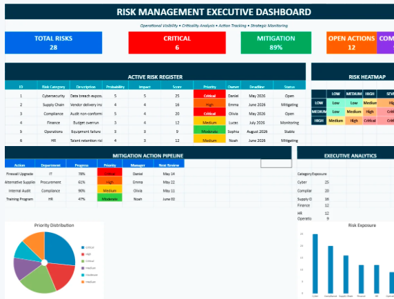
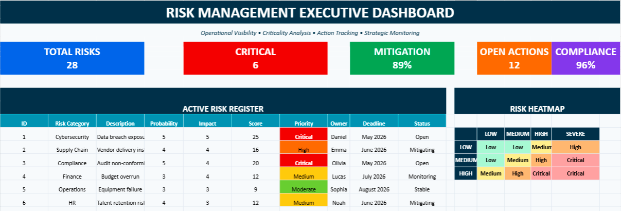
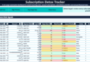
One-Page Operational Risk Monitoring and Mitigation System
This Excel dashboard helps organizations centralize, prioritize, and monitor operational risks inside a single visual workspace. Designed as a one-page executive command center, the file combines risk scoring, heatmaps, KPI monitoring, mitigation tracking, and exposure analysis within a highly visual and color-coded environment.
The dashboard supports daily risk governance by helping teams identify critical threats faster, follow mitigation progress more efficiently, and maintain clearer operational visibility across departments.
Assign probability and impact levels for each exposure.
The dashboard automatically highlights priority levels through color-coded criticality logic.
Update mitigation actions, owners, deadlines, and monitoring status.
Use the executive charts and heatmap to identify high-risk operational areas instantly.
The file is particularly useful for:
operational management,
project governance,
compliance monitoring,
procurement risk tracking,
cybersecurity oversight,
maintenance and infrastructure supervision,
executive reporting.
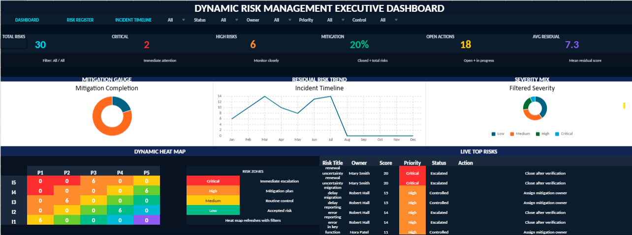
Dynamic Risk Management Visual Dashboard
This dynamic Excel dashboard has been designed as a compact executive cockpit for monitoring organizational risks in real time. It brings together automated risk scoring, interactive filters, visual indicators, circular KPI gauges, a dynamic heat map, and incident timeline tracking within a single one-page management view.
The model allows users to classify risks by category, department, probability, impact, residual score, mitigation status, owner, and priority level. Each entry feeds the dashboard automatically, helping decision-makers identify critical exposure areas, follow mitigation progress, and monitor the evolution of incidents with greater clarity.
Main Features
One-page executive dashboard with dark premium visual design
Interactive filters and drop-down menus for faster analysis
Automated risk score based on probability and impact
Dynamic residual risk heat map
Circular KPI gauges for executive monitoring
Charts that update automatically from the risk register
Incident timeline for monitoring risk evolution over time
Visual indicators inspired by Power BI dashboards
Navigation buttons for a smoother workbook experience
Risk register connected to the dashboard logic
Designed For
This dashboard is suitable for risk managers, project leaders, internal auditors, compliance teams, HSE departments, IT governance teams, financial controllers, and executives who need a clear and immediate view of operational, financial, strategic, cybersecurity, and compliance risks.
Management Value
Instead of treating risk data as isolated spreadsheet entries, this model transforms it into a structured decision-making environment. It helps organizations detect exposure patterns, prioritize corrective actions, assign responsibilities, and strengthen risk governance through a visual and automated Excel interface.
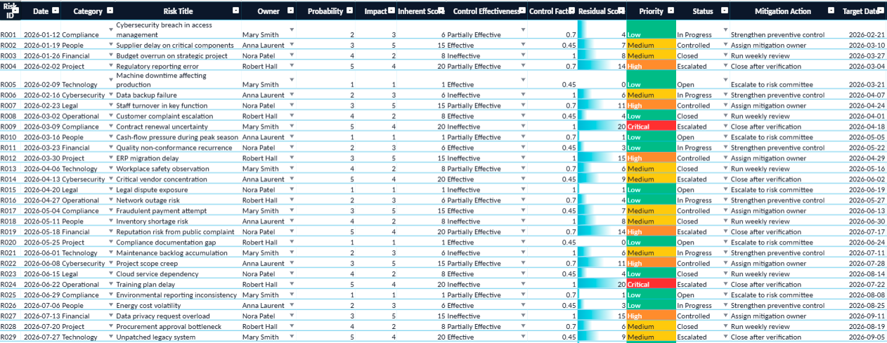
This Excel workbook has been developed as a centralized environment for monitoring, analyzing, and controlling organizational risks through a highly visual and automated structure. The file combines operational tracking, executive reporting, risk prioritization, and performance visibility within a single integrated workspace.
Built around a dynamic dashboard architecture, the workbook transforms raw risk data into actionable management insights. Interactive charts, automated indicators, residual exposure analysis, and visual heat mapping help decision-makers identify critical vulnerabilities more rapidly and supervise mitigation efforts with greater precision.
Executive Cockpit: condensed management view with live KPIs and dynamic charts.
Risk Intelligence Register: centralized database for monitoring operational and strategic risks.
Dynamic Heat Map: visual representation of probability and impact exposure levels.
Automated Scoring Engine: instant calculation of inherent and residual risk levels.
Interactive Analysis Tools: filters, lists, and visual indicators for rapid decision-making.
Incident Monitoring Timeline: chronological supervision of risk evolution and mitigation progress.
Governance Reporting View: executive-ready presentation for audits, committees, and management reviews.
The workbook is suitable for enterprise governance, internal audit, operational supervision, cybersecurity monitoring, compliance management, project risk analysis, industrial operations, and executive reporting environments requiring both analytical depth and visual clarity.