Financial Clarity Dashboard in Excel
Money rarely disappears all at once. More often, it fades quietly through subscriptions forgotten after a free trial, impulsive spending hidden inside contactless payments, recurring bills normalized by habit, and dozens of invisible micro-decisions repeated every month. Over time, financial pressure rarely comes from a single dramatic event. It emerges from accumulation, fragmentation, and lack of visibility.
That reality explains why many people earn a reasonable income while still feeling financially disorganized. The issue often has less to do with arithmetic than with clarity. Traditional spreadsheets track numbers. Very few create calm, perspective, or genuine financial understanding.
The Financial Clarity Dashboard was designed precisely around that missing dimension.
Rather than functioning like a rigid accounting document, this Excel dashboard operates as a personal financial visibility system inspired by modern fintech interfaces and lifestyle-oriented productivity tools. More than a rigid accounting spreadsheet, this Excel dashboard functions as a modern financial visibility system inspired by fintech platforms and lifestyle-focused productivity environments. Its purpose reaches far beyond traditional budgeting by helping users understand how money moves, detect recurring financial pressure, visualize spending patterns, and regain clearer control over everyday financial choices.
The result feels closer to a modern personal operating system than a conventional spreadsheet.
A Different Philosophy of Personal Finance
Many budgeting templates overload users with categories, formulas, and endless tables. The consequence becomes paradoxical: a tool meant to simplify financial life often creates additional cognitive fatigue.
This dashboard approaches financial organization differently.
Its structure focuses on three essential psychological needs:
- visibility
- simplicity
- emotional clarity
The interface was intentionally designed with calming visual tones, soft contrast, rounded sections, and a modern fintech-inspired layout. Every area seeks to reduce friction while improving financial awareness.
Instead of overwhelming the user with complexity, the dashboard prioritizes readability and financial breathing room.
A Premium One-Page Financial Dashboard
The workbook concentrates every essential financial indicator onto a single modern dashboard page. That choice matters.
Switching endlessly between tabs often breaks financial understanding. A one-page environment encourages immediate visibility and faster decision-making. Within seconds, users can identify:
- how much money entered during the month
- how much left
- which expenses create pressure
- which subscriptions silently drain cash flow
- whether financial breathing room is improving or shrinking
This structure transforms Excel into a visual financial command center.
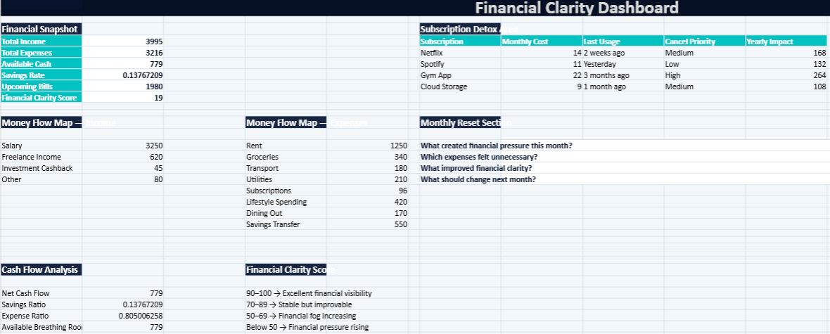
Financial Snapshot
Seeing the Month at a Glance
The first section of the dashboard presents a clean KPI-style financial overview inspired by modern finance applications.
Users instantly visualize:
- Total Income
- Total Expenses
- Available Cash
- Savings Rate
- Upcoming Bills
- Financial Clarity Score
This section functions as a financial pulse check.
Rather than forcing users to analyze raw transactions manually, the dashboard translates numbers into immediate visibility. The goal is psychological reassurance as much as mathematical tracking.
The “Available Cash” indicator proves especially valuable because it reveals the real breathing room remaining after expenses rather than displaying abstract balances disconnected from daily reality.
Money Flow Map: Understanding Where Money Actually Goes
One of the most common personal finance frustrations comes from the sensation that money disappears without explanation.
The Money Flow Map addresses that issue directly.
Instead of presenting spending as a long, sterile list, the dashboard organizes financial movement into meaningful lifestyle categories:
- salary income
- freelance income
- recurring expenses
- utilities
- subscriptions
- savings
- lifestyle spending
- discretionary purchases
This structure creates behavioral visibility.
Patterns emerge rapidly. Users begin identifying recurring habits, emotional spending triggers, and categories consuming disproportionate amounts of income.
That awareness often changes financial behavior naturally without requiring aggressive budgeting rules.
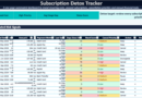
Subscription Detox Area: Identifying Silent Financial Leaks
Modern life runs on subscriptions.
Streaming platforms, cloud storage, fitness applications, premium productivity tools, delivery memberships, and countless micro-services gradually accumulate into significant yearly costs.
The Subscription Detox section helps users confront those invisible leaks with greater precision.
The dashboard tracks:
- subscription names
- monthly cost
- last usage date
- cancellation priority
- yearly financial impact
This final metric becomes particularly revealing.
A harmless £9 monthly subscription suddenly transforms into more than £100 per year once annualized. That shift in perception frequently changes purchasing decisions immediately.
The “Last Usage” column also introduces an important behavioral dimension. Many subscriptions survive purely because users forget they exist. Visibility alone often becomes enough to reduce unnecessary recurring expenses.
Monthly Reset Section: Financial Reflection Beyond Numbers
Most financial tools focus exclusively on transactions.
Very few encourage reflection.
The Monthly Reset area introduces a more human approach to money management through guided prompts such as:
- What created financial pressure this month?
- Which expenses felt unnecessary?
- What improved financial clarity?
- What should change next month?
These questions transform the workbook from a passive tracker into an active decision-making companion.
Financial organization improves significantly when users connect numbers with emotional context. Spending habits become easier to adjust once their psychological triggers become visible.
This reflective layer gives the dashboard a notably modern and lifestyle-oriented identity.
Cash Flow Analysis: Measuring Financial Breathing Room
Income alone rarely determines financial stability.
Cash flow matters more.
The dashboard automatically calculates:
- Net Cash Flow
- Savings Ratio
- Expense Ratio
- Available Breathing Room
The central formula remains straightforward:
\text{Net Cash Flow} = \text{Total Income} – \text{Total Expenses}
Yet the implications are powerful.
Positive cash flow indicates financial flexibility. Negative cash flow signals structural pressure that eventually accumulates into stress, debt, or instability.
The “Breathing Room” indicator was intentionally named to feel more human than traditional accounting terminology. Personal finance becomes easier to manage once metrics connect naturally with everyday life.
Financial Clarity Score: Turning Financial Visibility Into a Measurable Indicator
One of the most distinctive features of the workbook is the Financial Clarity Score.
This automatic score evaluates overall financial visibility on a scale from 0 to 100.
Interpretation levels include:
- 90–100 → Excellent financial visibility
- 70–89 → Stable but improvable
- 50–69 → Financial fog increasing
- Below 50 → Financial pressure rising
The score combines multiple dimensions:
- available cash
- savings ratio
- expense pressure
- financial breathing room
Rather than acting as a judgment tool, the score functions as an awareness indicator. Its objective involves helping users detect deterioration early before financial stress intensifies.
The visual simplicity of a score also makes financial trends easier to follow month after month.
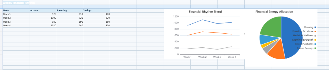
Visual Charts That Simplify Financial Understanding
Numbers alone rarely create clarity.
Visualization changes perception dramatically.
The workbook includes several integrated charts designed to improve immediate understanding:
- monthly spending overview
- income versus expense comparison
- subscription impact visualization
- savings progression analysis
These charts transform raw financial data into recognizable patterns.
Users can instantly identify:
- whether lifestyle spending increased
- which categories dominate monthly expenses
- how subscriptions accumulate over time
- whether savings momentum improves or weakens
This visual layer makes the dashboard feel considerably closer to a premium fintech application than a conventional spreadsheet.
A Dashboard Designed Around Calm and Readability
Visual atmosphere strongly influences how users interact with financial information.
Aggressive colors, overcrowded layouts, and excessive formulas often create unnecessary tension. This dashboard adopts the opposite philosophy.
The design incorporates:
- dark navy foundations
- soft blue highlights
- teal financial accents
- light gray balance zones
- white readability spaces
Rounded KPI sections and clean spacing contribute to a calmer financial experience.
The workbook intentionally avoids visual aggression. The objective consists of helping users think more clearly about money rather than amplifying anxiety.
Realistic UK Financial Example Data
The dashboard includes realistic UK-style sample data to help users understand how the system functions immediately.
Example categories include:
- salary income
- freelance revenue
- rent
- groceries
- utilities
- transport
- subscriptions
- savings transfers
- lifestyle expenses
Using realistic examples makes customization easier while helping users project their own financial structure into the dashboard naturally.
Personal Finance Visibility Dashboard in Excel
Most people roughly know how much they earn every month. Far fewer can clearly explain where that money actually disappears once rent, subscriptions, transport, groceries, utilities, and everyday spending begin to accumulate quietly in the background.
That is often where financial stress begins.
Not necessarily because income is too low, but because financial life starts feeling blurry, fragmented, and difficult to follow. Small recurring expenses pile up. Subscriptions become invisible. Spending habits lose visibility. The month moves quickly, while financial clarity slowly fades.
The Financial Clarity Dashboard was created to bring that clarity back.
Designed as a modern one-page Excel dashboard inspired by fintech applications and digital productivity systems, this workbook helps users organize their finances in a calmer, more visual, and more intuitive way. The experience feels less like traditional accounting and more like a personal money control center designed for real everyday life.
Annexe outil Excel
Everyday Money Clarity
Everyday Money Clarity désigne une approche simple et visuelle de la gestion financière personnelle. L’objectif consiste à rendre l’argent plus lisible au quotidien : revenus, dépenses, abonnements, reste disponible, habitudes de consommation et marge de sécurité.
Voir rapidement où va l’argent chaque mois.
Identifier les dépenses qui créent une pression invisible.
Arbitrer avec plus de recul, sans sensation de désordre.


: Investment, Taxation, and Property Management")