Logistics Dashboard Template in Excel: A Practical Tool for Clearer, Smarter Logistics Management
Logistics rarely fails because people lack data. More often, it fails because the right information is buried, scattered, or difficult to read at the moment it matters most.
Rather than leaving teams to work through disconnected reports, raw exports, and fragmented updates, a good dashboard brings the essential information together in one place. It gives managers, planners, warehouse teams, and operations leaders a simple way to understand what is happening, where performance is holding, and where pressure is starting to build.
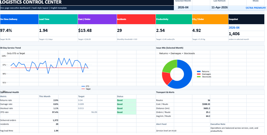
The model presented on the source page is built around indicators that speak directly to real logistics concerns: On-Time Delivery, lead time, cost per order, incidents, productivity, CO₂ per order, a 30-day trend view, and a transport-focused reading of performance. These are not decorative metrics. They reflect the practical questions logistics teams face every day.
A dashboard like this does more than collect numbers. It creates perspective. It makes performance easier to read and decisions easier to defend.
Logistics Dashboard – Why This Kind of Dashboard Really Matters
In logistics, small signals often announce larger problems. A few late deliveries may point to a transport issue. A rising cost per order may reveal inefficiencies that went unnoticed for weeks. A drop in productivity may come from poor workflow design rather than team performance. When these signals stay hidden inside spreadsheets or isolated reports, the business reacts too late.
A dashboard changes that. It turns logistics monitoring into something concrete and readable. Instead of moving from file to file, users can see the core of the situation at a glance. That alone saves time. More importantly, it sharpens judgment.
A well-designed dashboard helps teams:
spot operational drift earlier
follow service quality more closely
track cost without losing sight of quality
compare current performance with recent trends
support meetings with facts instead of impressions
move from reaction to control
Its real strength lies in clarity. It brings order to the noise of day-to-day operations.
A Tool Built for Real Operations
One of the strengths of the featured model is that it appears to focus on what truly matters, rather than trying to display everything at once. That is often the difference between a useful dashboard and a confusing one.
The source page highlights a structure centered on service, cost, incidents, productivity, environmental monitoring, short-term trends, and transport decision support. This gives the model a practical balance. It is broad enough to support management, yet focused enough to remain readable.
That balance is important. Logistics teams do not need a screen full of numbers. They need a reliable reading of performance.
The Main Areas of the Dashboard
A quick executive view
The first job of any dashboard is simple: it should tell the user, within seconds, whether operations are under control.
That is where the top-level KPI view matters. A short summary of the most important metrics creates an immediate reading of the situation. It helps answer a few essential questions:
Are deliveries being made on time?
Are lead times stable?
Is cost staying under control?
Are incidents becoming more frequent?
Is productivity moving in the right direction?
This kind of opening view is especially useful for managers who need a fast but trustworthy picture before going deeper into detail.
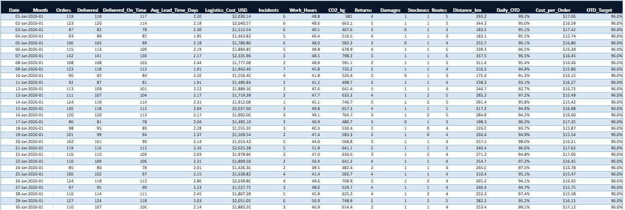
A 30-day trend that adds context
Single figures can be misleading when taken in isolation. A dashboard becomes much more valuable when it shows movement over time.
The source page refers to a 30-day trend, which adds exactly that kind of context. A KPI might look acceptable on one particular day, while the trend behind it is clearly deteriorating. On the other hand, a temporary dip may be less worrying when the broader movement remains positive.
This trend-based reading helps teams avoid overreacting to isolated events while still remaining alert to structural shifts.
A transport-focused decision view
Transport often sits at the heart of logistics tension. It affects cost, service quality, reliability, and customer perception all at once.
The model described on the source page includes a transport view designed to support operational trade-offs and arbitration. That is an important feature because transport decisions rarely depend on cost alone. A cheaper option may hurt service levels. A faster option may increase cost too sharply. A good dashboard helps make those compromises visible.
This part of the dashboard can support questions such as:
Is a transport mode still efficient?
Is a carrier underperforming?
Is route performance aligned with expectations?
Are service gains worth the added spend?
Incident monitoring that reveals execution quality
Incidents often tell the truth of operations.
A delivery can be counted as completed, yet still be late, incomplete, damaged, or problematic. That is why incident monitoring is so valuable. It gives a more honest reading of execution quality than volume alone.
The source page includes incidents among the central measures of the model, which makes sense in any dashboard meant for real operational control. Incident tracking helps expose recurring friction points and encourages a more disciplined improvement process.
Productivity as a measure of operational health
Productivity is one of those indicators that can look simple on paper but reveal a great deal in practice.
When productivity drops, the cause may lie in labor organization, layout problems, workflow bottlenecks, training gaps, equipment issues, or poor planning. When it improves, that improvement deserves to be understood and protected.
The source page places productivity among the key indicators, which gives the dashboard a stronger operational dimension. It becomes more than a reporting tool. It becomes a way to understand how efficiently the logistics system is functioning.
Environmental visibility through CO₂ per order
The inclusion of CO₂ per order gives the dashboard a more contemporary and strategic edge.
Logistics performance is no longer judged on speed and cost alone. Businesses increasingly need to understand the environmental footprint attached to operational choices. Measuring CO₂ per order allows teams to connect transport and fulfillment decisions with sustainability goals.
That does not make the dashboard more complicated. It makes it more complete.
The Core Indicators, Explained More Naturally
On-Time Delivery
On-Time Delivery, often shortened to OTD, remains one of the clearest indicators of logistics service quality. It shows whether the promise made to the customer is actually being kept.
A strong OTD rate usually reflects good coordination across the chain. A weak one rarely comes from a single cause. It may point to stock issues, transport delays, weak planning, or pressure in order preparation.
In that sense, OTD is not just a service metric. It is a signal of overall operational discipline.
Lead Time
Lead time measures how long it takes to move from order processing to delivery. It speaks directly to responsiveness.
What matters here is not only speed, but consistency. A stable lead time builds predictability. An unstable one creates uncertainty for both teams and customers.
Cost per Order
Total logistics cost can hide a lot. Cost per order brings the analysis back to a more useful unit.
It allows decision-makers to see whether the business is scaling efficiently or simply spending more as volumes rise. This indicator becomes even more useful when read alongside service quality. Low cost with poor delivery performance is rarely a true success.
Incidents
Incidents show where execution becomes fragile.
This may include damaged orders, delivery exceptions, missing products, or operational breakdowns. Even when the total number seems manageable, recurring incidents usually reveal structural weaknesses that deserve attention.
Productivity
Productivity reflects the relationship between resources used and results achieved.
It can be measured in different ways depending on the operation: lines picked per hour, orders prepared per shift, deliveries completed per route, or output per operator. Whatever the formula, the purpose remains the same: understanding how effectively the system is working.
CO₂ per Order
CO₂ per order adds a wider perspective to logistics performance.
It reminds decision-makers that efficiency has more than one dimension. A logistics process may look strong financially while carrying a heavier environmental cost than necessary. Tracking this indicator encourages more balanced decisions over time.
The 30-day trend
A trend line may seem secondary, yet it often changes the quality of interpretation completely.
It helps separate a temporary disturbance from a deeper pattern. That alone makes it one of the most useful features in a dashboard.
The transport reading of performance
Transport deserves its own reading because it affects service, cost, reliability, and emissions all at once.
The source page presents this transport-focused layer as part of the model’s logic, which gives the dashboard a more grounded operational role. It supports real decisions rather than passive observation.
Why Excel Still Makes Sense
Excel continues to hold a strong place in logistics reporting for a simple reason: it is practical.
It offers a level of flexibility that many teams still need. It can combine tables, formulas, charts, filters, trends, and alerts without requiring a heavy technical rollout. It also remains widely understood across companies, which makes adoption easier.
For smaller organizations, growing operations, or teams that want a strong reporting layer before moving to a more integrated environment, Excel remains a credible and efficient choice.
Its value lies in accessibility. A tool that teams can actually use often matters more than a system that looks more sophisticated on paper.
What Makes a Dashboard Useful in Real Life
A dashboard is only as valuable as the decisions it supports.
That is why the best ones tend to share a few qualities. They are selective. They are readable. They rely on clean inputs. They make variation visible. Most importantly, they stay close to operational reality.
A dashboard becomes genuinely useful when:
the indicators reflect real logistics priorities
the visual structure guides attention instead of distracting it
the data is refreshed often enough to remain credible
users can move quickly from observation to action
the tool supports conversations, not just reporting rituals
A good dashboard does not try to impress. It tries to help.
A logistics dashboard in Excel becomes powerful when it simplifies complexity without oversimplifying reality.
The model described on the source page stands out because it appears to focus on the right essentials: On-Time Delivery, lead time, cost per order, incidents, productivity, CO₂ per order, a 30-day trend, and a transport view designed for practical decision-making. That combination gives the tool real managerial value. It supports visibility, strengthens operational control, and improves the quality of logistics conversations inside the business.
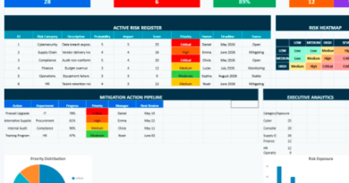
Transforming Risk Monitoring into a Structured Decision-Making Environment Advanced Dynamic Risk Register template in Excel Within most organizations, risk rarely
A Refined Approach to Risk Visibility, Strategic Control and Operational Stability Behind the apparent stability of many organizations, uncertainty constantly
In the operational heartbeat of any asset-intensive organization, preventive maintenance remains a cornerstone of longevity, performance, and reliability. But maintenance