Finance often appears most intimidating when it is presented as pure theory. The Capital Market Line, however, becomes far more intelligible once it is placed inside Excel. What begins as a formula in portfolio theory quickly turns into a practical visual instrument: a line that shows how expected return rises as total risk increases, provided the investor combines a risk-free asset with the market portfolio.
In that sense, Excel does more than calculate. It clarifies. It reduces abstraction, imposes structure, and turns a textbook concept into something that can be tested, plotted, and explained in a boardroom, a classroom, or an investment memo.
What the Capital Market Line actually represents
At its core, the Capital Market Line (CML) shows the best expected return available for a given level of total portfolio risk. That distinction matters. The CML does not describe every portfolio. It describes only the combinations that lie on the efficient set when investors can allocate funds between:
a risk-free asset
the market portfolio
As a result, the line begins at the risk-free rate and rises toward the market portfolio, extending beyond it for leveraged positions.
This compact equation carries an important idea: investors are compensated for taking risk, though only insofar as that risk is attached to an efficient allocation.
Why Excel is the right place to build it
A concept such as the CML can remain abstract for too long when it lives only in theory. Excel changes that immediately. It gives the line a scale, a slope, and a visible shape. More importantly, it allows the user to test assumptions with speed.
In practical terms, Excel helps because it allows you to:
organise assumptions cleanly
calculate returns across multiple risk levels
plot the line in seconds
update the chart dynamically when market inputs change
Consequently, the CML stops being a formula to memorise and becomes a model to use.
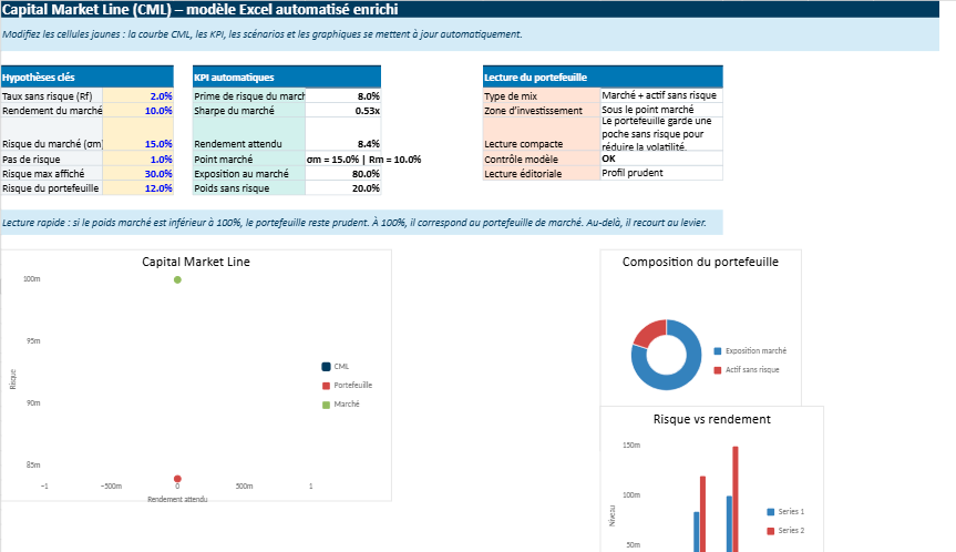
Step 1 — Set up the key assumptions
Every sound model begins with a disciplined input section. Keep it compact, readable, and separate from the calculation area.
Example input block
Cell
Label
Value
B1
Risk-Free Rate
2%
B2
Market Return
10%
B3
Market Risk
15%
These three figures form the backbone of the model.
What they mean
Risk-Free Rate: the return offered by an asset assumed to carry no default risk
Market Return: the expected return of the market portfolio
Market Risk: the standard deviation of the market portfolio
At this stage, the structure already tells a story. The market, in this example, offers an 8% excess return above the risk-free rate, in exchange for 15% total risk.
Step 2 — Create a range of portfolio risk values
Once the assumptions are in place, the next task is to define the possible levels of risk you want to test. These values will sit on the horizontal axis of the chart.
Example risk series
Portfolio Risk
0%
2%
4%
6%
8%
10%
12%
14%
16%
18%
20%
The logic is simple. At 0% risk, the investor holds only the risk-free asset. As risk increases, the portfolio moves along the CML toward the market portfolio and, beyond that point, toward leveraged exposure.
Why this matters
This column is not just a list of numbers. It is the framework that allows Excel to translate a theoretical relationship into a visible progression.
Step 3 — Apply the CML formula in Excel
Now comes the calculation itself. Suppose:
B1 contains the risk-free rate
B2 contains the market return
B3 contains the market risk
A6 contains the first portfolio risk value
The Excel formula is:
=$B$1+(($B$2-$B$1)/$B$3)*A6
Then copy it downward.
This formula takes the excess market return, scales it by market risk, and applies that ratio to the risk level of the portfolio being tested. In effect, it tells Excel how much return should correspond to each incremental unit of risk.
Step 4 — Read the numbers before drawing the chart
A strong financial model should always be interpreted before it is presented visually. Using the assumptions above, the table would look like this:
Portfolio Risk
Expected Return
0%
2.00%
2%
3.07%
4%
4.13%
6%
5.20%
8%
6.27%
10%
7.33%
12%
8.40%
14%
9.47%
15%
10.00%
18%
11.60%
20%
12.67%
Several points stand out immediately.
At 0% risk, return equals the risk-free rate, which is exactly what theory predicts.
At 15% risk, expected return reaches 10%, which identifies the market portfolio.
Beyond that, the line continues upward, reflecting leveraged exposure.
Thus, even before the chart is inserted, the model is already coherent.
Step 5 — Plot the Capital Market Line
With the calculation table ready, select the two columns:
Portfolio Risk
Expected Return
Then go to:
Insert
Scatter
Scatter with Straight Lines
This is the appropriate chart type because the CML is a continuous linear relationship. A standard line chart can distort the logic by treating the horizontal axis as categories rather than numeric risk levels.
A clean chart often carries more authority than an overloaded one.
Step 6 — Mark the market portfolio clearly
A more polished chart should highlight the tangency point, which represents the market portfolio.
In the example above, that point is:
Risk = 15%
Return = 10%
Add a data label or a separate marker for this observation. It improves readability and helps the viewer grasp the logic immediately.
This point matters because it is where the CML meets the efficient frontier. In portfolio theory, that is the optimal risky portfolio, the one that rational investors combine with the risk-free asset depending on their appetite for risk.
What the slope tells you
The slope of the CML is not simply a visual angle. It expresses the Sharpe ratio of the market portfolio. In practical terms, it shows how much excess return investors receive for each unit of total risk.
The Excel formula for that is:
=($B$2-$B$1)/$B$3
With the earlier numbers:
=(10%-2%)/15%
That gives:
0.5333
In other words, the market portfolio generates roughly 0.53 units of excess return for each unit of risk.
This is where the CML becomes more than geometry. It becomes a compact statement about the price of risk in an efficient market setting.
A practical example of interpretation
Imagine you are comparing two portfolio positions.
Portfolio A has 8% risk
Portfolio B has 16% risk
Using the CML, Excel shows that:
Portfolio A should offer around 6.27% return
Portfolio B should offer around 10.53% return to 10.67%, depending on exact rounding and increments
That comparison is useful because it frames return expectations in a disciplined way. A portfolio that sits materially below the CML may be poorly constructed. A portfolio on the CML, by contrast, reflects an efficient combination of risk-free lending or borrowing and market exposure.
How to make the model feel more professional
A basic worksheet is sufficient for calculation. A credible worksheet, however, requires a little more care. Presentation matters, especially when the file is intended for teaching, reporting, or portfolio review.
Useful upgrades
Use named cells for cleaner formulas
Separate inputs from outputs
Add a small KPI box for the Sharpe ratio
Use percentage formatting consistently
Add a note beside the market portfolio point
Example KPI section
KPI
Formula
Result
Excess Market Return
=B2-B1
8%
Sharpe Ratio
=(B2-B1)/B3
0.5333
Market Portfolio Risk
input
15%
Market Portfolio Return
input
10%
This kind of compact dashboard makes the worksheet more legible and more persuasive.
Common mistakes that weaken the model
Excel is efficient, though it is unforgiving. A small formatting mistake can flatten the logic of the model almost instantly.
Errors to avoid
entering 15 instead of 15%
mixing monthly returns with annual volatility
using variance rather than standard deviation
inserting the wrong chart type
forgetting to lock the input cells with absolute references
These are small errors in appearance, though large errors in consequence. In finance, presentation and precision often rise or fall together.
Why the CML remains useful in practice
The Capital Market Line belongs to financial theory, yet its usefulness is practical. It gives analysts, students, and decision-makers a disciplined way to think about the trade-off between safety and performance.
In Excel, that usefulness becomes immediate.
It helps explain the role of the risk-free asset
It shows why the market portfolio occupies a central position
It visualises the relationship between risk and return
It supports cleaner communication in reports and presentations
That is precisely why the CML continues to matter. It is elegant in theory, though persuasive in a spreadsheet.
Final takeaway
Getting the Capital Market Line in Excel is not difficult. The real value lies in doing it clearly. Start with the three essential assumptions. Build a risk series. Apply the CML formula. Plot the result with a scatter chart. Then refine the presentation so the logic becomes immediately legible.
In the end, the spreadsheet does something useful: it turns a formula into an argument. It shows that risk, when efficiently taken, should be matched by return. Excel merely draws the line. The theory gives it meaning.
Quick recap
Enter the risk-free rate, market return, and market risk
List a range of portfolio risk levels
Apply the CML formula
Insert a scatter chart with straight lines
Highlight the market portfolio point
Interpret the slope as the Sharpe ratio
This Excel file is designed to make the Capital Market Line feel much more intuitive.
Capital Market Line in Excel — A Visual and Interactive Risk–Return Model 📊
Instead of working with abstract formulas, you simply enter a few key assumptions — the risk-free rate, the market return, and the market volatility — and the model does the rest. Instantly, it builds the full relationship between risk and expected return, and shows it visually through clean charts.
What makes it interesting is how quickly you can see the impact of your assumptions. Change one number, and the whole line adjusts. The slope becomes steeper or flatter, the expected returns shift, and the overall picture of the market changes in real time.
So rather than being just a calculation tool, the sheet becomes a way to explore the logic of portfolio theory. It helps you understand how investors move from a risk-free position toward the market portfolio, and what they should expect in return for taking on more risk.
Capital Market Line Model for Saxo Capital Markets Analysis
This interactive Excel model brings the capital market line into a clearer, more practical framework.
Built for users who follow capital markets closely, it helps translate theory into a visual structure that is easier to read, compare, and explain.
For readers exploring Saxo Capital Markets, the file offers a structured way to connect market assumptions, expected return, volatility, and allocation logic in one place.
Capital Market Line
Visualizes the relationship between portfolio risk and expected return through a dynamic CML curve.
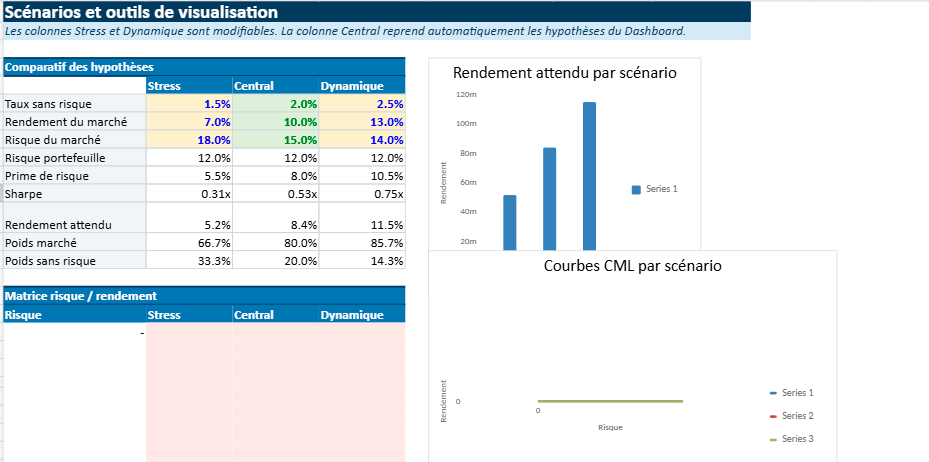
Capital Markets View
Tests different assumptions for market return, volatility, and risk-free rate across several scenarios.
Capital Market Logic
Shows how investors move from the risk-free asset toward the market portfolio as risk increases.
Market Capitalization Angle
Fits naturally into broader discussions around market capitalization, asset pricing, and portfolio construction.
The strength of this model lies in its simplicity. A few core inputs are enough to generate automatic calculations, scenario comparisons, and readable charts.
That makes it useful for financial education, investment presentations, and analytical content related to Saxo Capital Markets or broader capital market topics.
Dynamic CML chartSharpe ratio viewScenario comparisonRisk-return dashboard
Financial Insight
Understanding Market Capitalization
Market capitalization is one of the most widely used measures in finance because it offers a quick way to estimate the market value of a listed company.
It is calculated by multiplying the company’s share price by its total number of outstanding shares.
Simple in appearance, this figure plays an important role in how investors compare companies, classify stocks, and interpret market size.
Definition
The total market value of a company’s equity, based on current stock price and shares outstanding.
It helps investors distinguish between large-cap, mid-cap, and small-cap companies and assess market scale more clearly.
In practice, market capitalization is often used as a starting point rather than a final judgement. A large market cap may suggest scale and maturity, while a smaller one may point to faster growth potential or higher volatility.
That is why investors usually read market capitalization alongside profitability, valuation ratios, debt levels, and broader market conditions.
Quick Example
If a company’s share price is $50 and it has 20 million shares outstanding, its market capitalization is $1 billion.