Analyzing the Real Effectiveness of HR Dashboard Templates in Excel
HR teams rarely lack data. They lack clarity. Headcount lists live in one file, recruitment pipelines in another, training logs somewhere else, and turnover reasons often sit in emails or meeting notes. Over time, reporting turns into a routine of pulling numbers together, formatting slides, and hoping the story makes sense.
An HR dashboard template in Excel, when it is designed well, changes that rhythm. It turns HR reporting from a recurring scramble into a steady habit of monitoring, understanding, and acting. Excel will not replace a modern HR analytics platform in every environment, but it can do an impressive amount of work—especially for organizations that want structured insight without long implementation cycles.
What matters is not whether the dashboard looks polished. What matters is whether it helps people make better decisions, faster, with fewer arguments about what the numbers mean.
What an Excel HR Dashboard Really Does
A dashboard is often described as a “single view” of key metrics. In HR, that is true, but incomplete. The best dashboards do more than display results. They create a shared language across HR, finance, and operations.
A solid Excel HR dashboard typically performs four jobs at once:
- It consolidates employee data into one structured system (even if it still begins as separate files).
- It standardizes definitions: what counts as turnover, what counts as “time to hire,” how “active employees” are measured.
- It visualizes change over time, which is where workforce risk usually appears first.
- It guides attention by highlighting metrics that move outside normal ranges.
In practice, the dashboard becomes less like a report and more like a weekly instrument panel: something you open often, not something you build under pressure.
Why Excel Still Fits HR Reality
Excel remains popular for HR dashboards for reasons that are practical rather than nostalgic.
People already use it. HR teams do not need a new set of credentials, new training sessions, or a new vendor relationship to start measuring the basics.
It is fast to deploy. A template can be adapted in days, not months. That speed matters when leadership wants visibility quickly, or when HR needs a reporting structure before the next planning cycle.
It is flexible. Excel dashboards can support a wide range of organizational styles. Some companies track a small set of executive KPIs. Others want detailed breakdowns by site, department, manager, contract type, or grade.
It is forgiving. A dashboard can start simple and grow over time. Many strong HR dashboards begin as “version 1” with five key metrics and then evolve once the team learns what is truly useful.
The point is not that Excel is perfect. The point is that Excel meets teams where they already work.
What “Effective” Means for an HR Dashboard
Effectiveness is not measured by how many charts appear on the screen. A dashboard is effective if it produces better decisions with less friction.
In HR, the clearest signs of effectiveness include:
- Leaders spend less time debating the accuracy of the numbers.
- HR conversations shift from “what happened?” to “why is this happening?” and “what do we do next?”
- Managers begin using the dashboard without needing HR to interpret it every time.
- The organization spots workforce problems earlier, when they are still manageable.
A dashboard succeeds when it becomes a routine reference, not a file that gets opened only before meetings.
Metrics That Actually Earn Their Place on the Dashboard
Many dashboards fail because they try to measure everything. Effective HR dashboards are selective. They track the few metrics that explain workforce stability, growth, and capability.
Most dashboards include a version of these core indicators:
1) Headcount and Workforce Structure
This is the foundation: total employees, growth rate, distribution by department/site, contract type, grade, and tenure.
A good dashboard does not only show totals. It shows composition. A stable headcount can hide risk if the mix is changing in sensitive areas.
2) Turnover and Retention
Turnover becomes meaningful when it is broken down intelligently: voluntary vs. involuntary, early attrition (first 3–12 months), turnover by manager/team, and turnover reasons where possible.
The most useful dashboards show turnover as a trend and make it easy to segment quickly.
3) Recruitment Performance
Time to hire, time in stage, pipeline conversion rates, offer acceptance rate, and source performance can tell you whether the hiring engine is healthy.
One subtle but important metric is aging: how long roles remain open. That number often predicts workload pressure and burnout.
4) Absence and Attendance Signals
Absenteeism is not only an operational issue. It is often an early cultural and health indicator. Trends by site, seasonality, and repeated short absences can signal where attention is needed.
5) Learning and Capability Development
Training hours, course completion, certification rates, and internal mobility indicators help answer one of the most strategic HR questions: are we building the skills we will need next year?
An effective dashboard treats learning metrics as a business capability indicator, not a box-ticking exercise.
The Quiet Power of Visuals: Seeing Problems Earlier
HR dashboards work because visuals reduce cognitive load. They make patterns obvious.
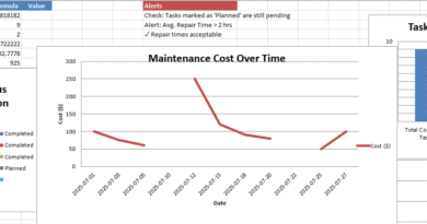
A well-built line chart showing voluntary turnover over 12 months often tells a clearer story than a long explanation. A heatmap by department can point to a localized issue that overall averages hide. Simple traffic-light indicators can surface risk areas without overdramatizing normal variation.
The goal is not to “decorate” the data. The goal is to compress complexity into a view that busy people can read quickly.
That said, visuals can mislead if the underlying structure is weak. The dashboard must guide interpretation rather than encourage superficial conclusions.
Where Excel Dashboards Can Break Down
Excel dashboards have real limits, and acknowledging them is part of using them responsibly.
Data entry risk. Manual input invites errors. One missing date or inconsistent department name can distort a report. The more the dashboard relies on clean structure, the more it needs validation rules and controlled input formats.
Version confusion. If multiple people edit the file, teams can end up with competing versions. Cloud-based storage and clear ownership reduce this risk, but it remains a common pain point.
Scaling issues. Large datasets and heavy formulas can slow Excel down. Performance usually drops when teams combine large tables, complex pivots, and many charts without optimizing structure.
Security sensitivity. HR data is confidential. Excel files can be copied, forwarded, or downloaded. Access control, encryption, and strict sharing habits are essential.
Excel works best when it supports clear reporting and early analytics—not when it becomes a complex system trying to behave like a full HR data warehouse.
What Makes an Excel HR Dashboard Trustworthy
Trust is the difference between a dashboard that drives action and a dashboard that gets ignored.
To build trust, effective dashboards include:
- Clear definitions (for example, how turnover is calculated, what dates are used, what is excluded).
- Input validation (dropdown lists for department names, date checks, mandatory fields).
- Audit-friendly structure (raw data separated from calculations; calculations separated from the dashboard view).
- Consistency over novelty (stable KPI definitions over time, so trends remain meaningful).
- Smart segmentation (filters by department, site, tenure, contract type, role category).
When dashboards are structured this way, leaders stop questioning the numbers and start discussing the implications.
How Dashboards Improve Decision-Making in Real Organizations
In practice, HR dashboards influence decisions in very specific ways.
They help HR teams detect risk early—such as rising early attrition, recruitment bottlenecks, or sudden absence spikes. They help leaders allocate resources—such as training budgets, headcount approvals, or retention initiatives. They also support more disciplined workforce planning by showing growth patterns, talent gaps, and internal mobility capacity.
Most importantly, they reduce reactive management. Instead of responding late to workforce disruption, teams can respond while the signal is still small.
That is the real value: not more reporting, but better timing.
When It Is Time to Move Beyond Excel
Excel dashboards often remain effective longer than people expect. Still, there are clear signs that a business is outgrowing them:
- Real-time reporting becomes essential.
- Multiple data sources must connect automatically (HRIS, payroll, ATS, LMS).
- The organization needs predictive analytics, not just descriptive metrics.
- Access control and audit requirements become strict and complex.
- The dataset grows large enough that Excel performance and governance become unstable.
At that point, many organizations keep Excel as a reporting layer while shifting the core data model into a BI platform or HR analytics system.
Excel does not fail because it is “basic.” It fails when teams ask it to do jobs it was not designed to do at scale.
Excel Dashboards Work When They Respect HR Reality
HR dashboard templates in Excel can be highly effective, especially when the goal is visibility, alignment, and faster decisions. Their strength lies in accessibility: teams can implement them quickly, customize them easily, and use them without a steep learning curve.
The value is real when the dashboard is built on reliable data, clear definitions, and thoughtful design—focused on the metrics that genuinely shape workforce outcomes.
Used well, an Excel HR dashboard becomes more than a reporting tool. It becomes a steady reference point that keeps HR grounded in evidence while staying close to operational reality.
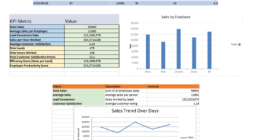
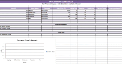
HR Analytics Dashboard in Excel
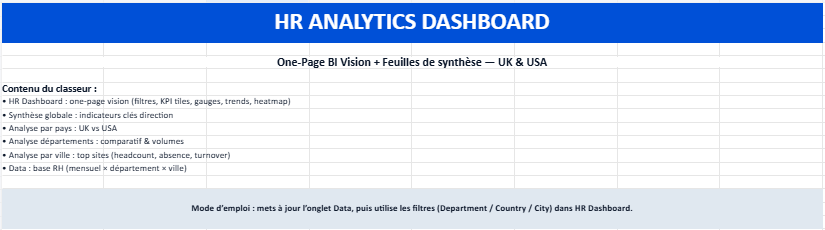
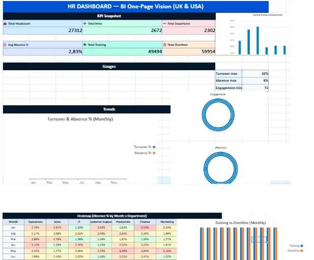
This Excel workbook has been designed as a compact HR analytics toolkit that combines a one-page dashboard with several analytical sheets. The goal is simple: give managers and HR teams a clear, visual understanding of workforce trends across UK and US locations without requiring complex BI software.
All indicators, charts, and gauges update automatically when the data sheet is refreshed. The file therefore works both as a reporting tool and as a daily operational dashboard.
How to Use the Workbook
1. Start with the Data sheet
The Data sheet is the foundation of the entire dashboard.
Here you will find structured HR information such as:
- Month
- Department
- Country and City (UK / USA locations)
- Headcount
- New hires and departures
- Absence days
- Training hours
- Overtime hours
- Employee engagement score
To update the dashboard, simply replace or edit the values in this sheet.
All calculations, charts, and indicators will refresh automatically.
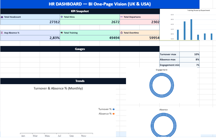
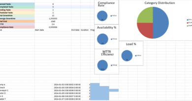
2. Open the HR Dashboard (One-Page View)
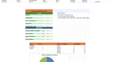
The HR Dashboard sheet presents a visual snapshot of workforce performance.
This page gathers the most important indicators in a single screen:
- KPI tiles showing totals and averages
- Semi-circular gauges displaying turnover, absence, and engagement levels
- Monthly trend charts for hiring, departures, training, and overtime
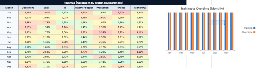
- Absence heatmap highlighting departments and periods with higher absence rates
This layout allows decision-makers to quickly identify patterns, risks, or opportunities.
3. Use the Filters
At the top of the dashboard you can apply filters for:
- Department
- Country
- City or site
Selecting a filter instantly recalculates the indicators so you can explore the data at different levels — from a global company view down to a single location.
4. Explore the Analytical Sheets
The workbook also includes several synthesis sheets designed for deeper analysis.
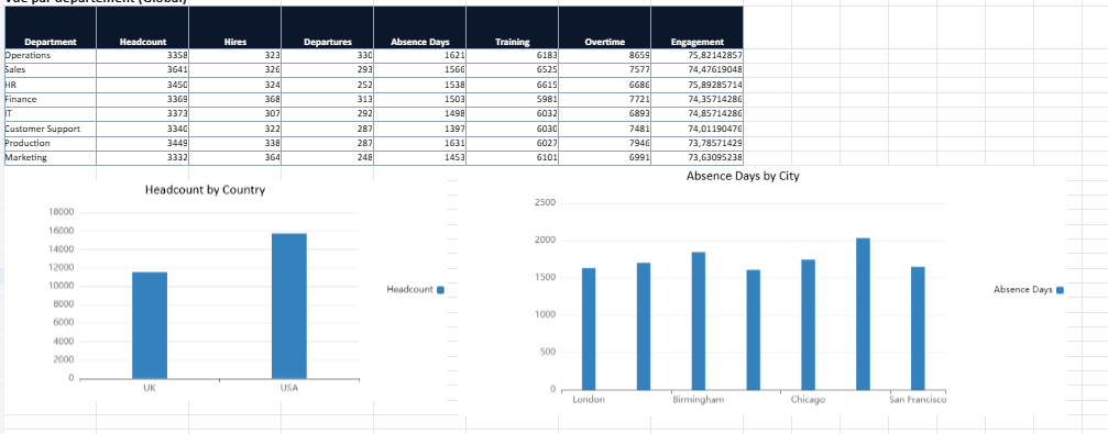
Global Summary
Provides a high-level overview of total headcount, hires, departures, engagement levels, and overall workforce activity.
Country Analysis
Compares HR indicators between the United Kingdom and the United States.
Department Analysis
Shows workforce metrics by department, helping identify areas with heavier workload, higher training investment, or stronger engagement.
City Analysis
Focuses on individual sites such as London, Manchester, New York, Chicago, Austin, or San Francisco to detect local trends.
What This Dashboard Is Designed For
This workbook can be used for many HR management purposes, including:
- Workforce monitoring
- HR reporting to leadership teams
- Operational decision support
- Early detection of turnover or absence trends
- Comparing sites, departments, and countries