Maintenance KPI dashboard in Excel for Downtime and Equipment Performance
Maintenance KPI Tracker in Excel for Downtime and Equipment Performance
A Practical and Visual Excel Solution for Tracking Maintenance Costs, Downtime and Equipment Performance
Maintenance teams rarely struggle because they lack technical expertise. More often, the real difficulty comes from visibility.
Machines stop unexpectedly. Emergency interventions begin accumulating. Spare-parts expenses quietly increase month after month. Downtime affects production schedules, yet the broader operational picture remains difficult to understand because information is scattered across multiple files, handwritten notes, intervention sheets or disconnected reports.
Over time, even experienced maintenance departments can lose clarity on where the real operational pressure is coming from.
That is precisely why a structured maintenance dashboard becomes so valuable.
This multi-color Excel maintenance dashboard template was designed to help maintenance teams organize, monitor and interpret maintenance activity in a more practical and visual way. Rather than functioning as a simple spreadsheet, the workbook acts as an operational control center where costs, equipment availability, repair duration and maintenance KPIs become easier to follow and easier to explain.
The objective is not only to record technical interventions. The objective is to create visibility around equipment performance and maintenance efficiency.
Why Maintenance Visibility Matters More Than Ever
Inside industrial environments, technical operations move quickly. Production lines, HVAC systems, compressors, forklifts, generators, conveyors and critical assets are expected to remain operational continuously.
Yet maintenance departments often work under constant pressure.
One unexpected breakdown can disturb an entire production cycle. A delayed intervention can create operational bottlenecks across multiple departments simultaneously. A machine that appears stable may quietly consume a growing maintenance budget through repetitive minor failures.
Without structured monitoring, these issues remain difficult to identify early.
That is where dashboards change the dynamic.
Instead of reacting constantly to emergencies, maintenance teams begin understanding:
- which machines create the highest operational risk,
- where maintenance costs increase progressively,
- how downtime evolves over time,
- whether preventive maintenance truly improves reliability,
- which interventions consume the most resources,
- which equipment requires deeper technical analysis.
The Excel template was designed around those operational realities.
A Dashboard Built for Real Maintenance Environments
Many maintenance spreadsheets become difficult to use because they focus heavily on data entry while offering very little operational interpretation.
This model takes a different approach.
The workbook was designed to feel practical for day-to-day maintenance operations while remaining visually clear enough for management reporting and monthly reviews.
The multi-color structure improves readability and helps users navigate rapidly between sections. KPI blocks, dashboards, maintenance logs and summary tables were organized to support both technicians and supervisors without overwhelming the user with unnecessary complexity.
The result is a maintenance dashboard that feels structured, modern and immediately operational.
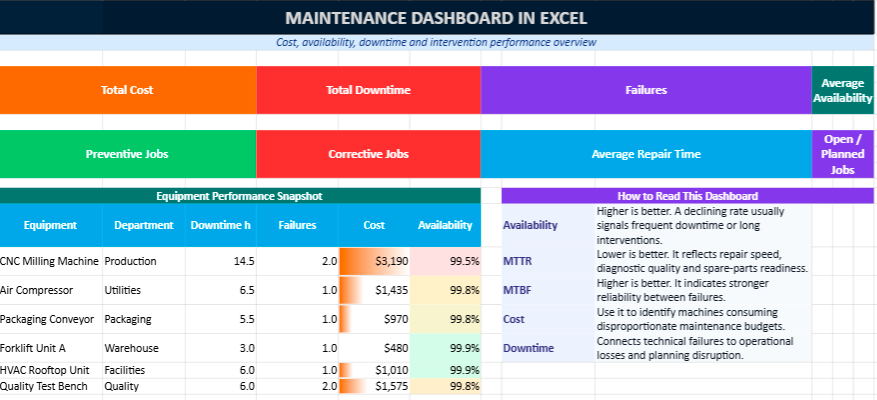
What the Excel Maintenance Dashboard Includes
📊 Interactive Dashboard Overview
The main dashboard provides a visual overview of maintenance activity through KPI cards, charts and performance indicators.
Instead of searching through dozens of intervention lines manually, users gain an immediate understanding of maintenance performance through:
- maintenance cost trends,
- downtime analysis,
- equipment availability indicators,
- intervention statistics,
- preventive versus corrective maintenance ratios,
- recurring failure visibility.
The dashboard was designed to simplify operational interpretation during technical reviews, production meetings and monthly reporting sessions.
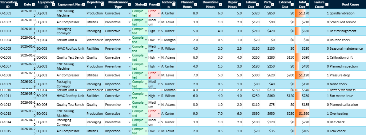
🛠 Maintenance Log Sheet
The maintenance log acts as the operational history of interventions.
Each intervention can include:
- intervention date,
- machine or equipment name,
- technician responsible,
- intervention category,
- downtime duration,
- repair duration,
- maintenance cost,
- operational status,
- technical observations.
Over time, this sheet becomes extremely valuable because it reveals recurring patterns that remain invisible inside isolated reports.
For example, a machine may appear stable operationally while generating small repetitive failures every few weeks. Individually, these interventions may seem insignificant. Together, they may reveal growing reliability issues or aging equipment conditions.
The dashboard helps make those patterns visible.
⚙ Equipment Register
The equipment register centralizes technical information related to assets and machines.
Typical information includes:
- equipment ID,
- asset category,
- installation date,
- operational department,
- maintenance frequency,
- technical status,
- serial references,
- equipment location.
This structure simplifies preventive maintenance planning and improves equipment traceability across operations.
For organizations managing large numbers of assets, this sheet becomes particularly useful for organizing technical monitoring activities more efficiently.
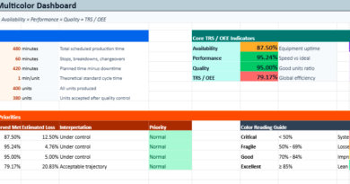
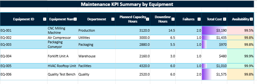
📈 KPI Summary and Maintenance Indicators
The KPI section consolidates maintenance data into operational indicators that support decision-making and technical analysis.
Key indicators include:
- MTBF (Mean Time Between Failures),
- MTTR (Mean Time To Repair),
- equipment availability rate,
- downtime hours,
- intervention frequency,
- maintenance cost evolution,
- preventive versus corrective maintenance ratios.
These indicators help maintenance teams move beyond intuition and begin evaluating performance more objectively.
For example:
- rising MTBF values generally indicate improving equipment reliability,
- increasing MTTR may reveal slower interventions or spare-parts delays,
- falling availability rates often signal deeper operational instability.
Over several months, these trends become extremely valuable for understanding equipment behaviour.
Why Excel Still Remains Highly Relevant
Despite the expansion of specialized CMMS software, Excel continues to remain one of the most practical tools for many maintenance departments.
That is largely because Excel combines:
- accessibility,
- flexibility,
- speed of deployment,
- customization capacity,
- operational familiarity.
Most maintenance teams already work with Excel daily. Supervisors can adapt formulas, modify tables, create filters or add charts without requiring complex software deployment or external integration projects.
This flexibility allows organizations to begin with a manageable structure and improve the workbook progressively according to operational needs.
For many companies, that simplicity remains extremely valuable.
A Multi-Color Design Created for Better Readability
One of the challenges of traditional maintenance spreadsheets is visual fatigue. Dense tables filled with monochrome data quickly become difficult to interpret.
This workbook introduces a more modern visual structure through:
- multi-color KPI cards,
- highlighted indicators,
- color-coded sections,
- dashboard charts,
- visual separators,
- structured tables.
The objective is not purely aesthetic.
Colors improve navigation speed, make anomalies easier to identify and simplify dashboard interpretation during operational reviews.
Visual clarity becomes especially important when managers need to analyze maintenance performance quickly during meetings or reporting sessions.
Useful Across Multiple Industries
The template can support a wide range of operational and industrial environments, including:
- manufacturing plants,
- logistics centres,
- workshops,
- transportation fleets,
- hospitals,
- facility management,
- energy installations,
- HVAC operations,
- technical service departments.
The structure remains flexible enough to adapt to different equipment categories, intervention types and reporting needs.
Some organizations may focus heavily on downtime analysis, while others prioritize maintenance budgeting or preventive planning. The workbook can evolve accordingly.
More Than a Spreadsheet
A maintenance dashboard should not simply archive interventions. Its real value comes from helping organizations understand operational performance more clearly.
When maintenance teams can monitor downtime, repair duration, equipment availability and maintenance costs inside one structured environment, operational decisions become easier and significantly more strategic.
This Excel template was created with that practical philosophy in mind:
to provide a maintenance dashboard that feels useful in real operational conditions while remaining simple enough for daily use.
Over time, that visibility can help reduce downtime, improve preventive maintenance planning, control costs more effectively and strengthen long-term equipment reliability across the organization.
Maintenance performance becomes far more effective when preventive actions are planned before failures disrupt operations. A structured preventive maintenance strategy helps organizations reduce unexpected downtime, extend equipment lifespan and improve operational stability across production environments. The preventive maintenance dashboard in Excel presented in this companion article explores how scheduled interventions, KPI monitoring and maintenance planning can transform Excel into a practical preventive maintenance management tool.
Maintenance KPI Dashboard in Excel: Tracking Costs, Availability and Downtime with Greater Clarity
A maintenance dashboard in Excel gives maintenance teams a practical way to follow equipment costs, availability, downtime, repair duration and recurring failures. Instead of keeping scattered intervention notes, the dashboard turns technical data into clear indicators that support better decisions, better planning and stronger operational control.
Every maintenance department eventually reaches the same turning point. Machines continue running, interventions multiply, technicians respond to emergencies day after day, yet the broader operational picture remains difficult to read. Costs increase gradually, downtime becomes more frequent, and recurring failures start consuming valuable production hours.
That is where a maintenance dashboard in Excel becomes more than a simple spreadsheet. It becomes a working tool for supervisors, maintenance managers, production leaders and technical teams who need to understand what is happening on the ground, which equipment deserves attention, and where resources should be directed first.
Why Maintenance Monitoring Has Become Essential
Modern organizations depend heavily on equipment continuity. A production line stopped for two hours can delay deliveries, disturb planning, generate financial losses and create pressure across several departments at the same time. In logistics, a conveyor failure can slow down shipments. In a hospital, technical equipment downtime can affect service quality. In a factory, one unavailable machine can disturb the entire production flow.
Maintenance therefore occupies a strategic position inside operational environments. It protects productivity, safety, quality and cost control. Yet many organizations still manage maintenance activities through isolated files, handwritten notes, email exchanges or intervention sheets that remain difficult to consolidate.
A structured dashboard changes that dynamic. Instead of reacting constantly to emergencies, companies begin identifying trends, weak points, hidden costs and recurring technical problems. Maintenance becomes easier to explain, easier to measure and easier to improve.
Why Excel Remains a Practical Choice for Maintenance Teams
Despite the rise of specialized CMMS platforms, Excel remains widely used because it is accessible, flexible and familiar. Many maintenance teams already use Excel for spare-parts lists, intervention schedules, monthly reports or cost summaries. This makes adoption easier, especially for small and medium-sized organizations.
Excel also allows teams to start with a simple structure and improve it progressively. A maintenance manager can add columns, formulas, filters, charts, pivot tables, conditional formatting and KPI cards according to operational needs. The file can evolve with the organization instead of forcing teams into a rigid system.
What Excel makes possible
- Centralize maintenance interventions in one structured table.
- Calculate costs automatically by machine, department or month.
- Track preventive and corrective maintenance separately.
- Measure downtime and availability with clear formulas.
- Create visual dashboards for monthly reporting.
- Detect recurring failures through filters and trend analysis.
A Dashboard Designed Around Real Maintenance Questions
A useful maintenance dashboard should answer operational questions quickly. It should not only store data. It should guide decisions. When a manager opens the file, the dashboard must immediately reveal which machines are costly, which interventions are too long, and which breakdowns deserve deeper analysis.
- Which equipment generates the highest maintenance costs?
- Which machines experience the longest downtime?
- How long do interventions usually last?
- Are preventive actions reducing failures effectively?
- Which assets are becoming increasingly unreliable?
- Which department consumes the largest share of maintenance resources?
- Which month shows abnormal maintenance spending?
- Which technician workload requires better balancing?
Main Sections of the Excel Maintenance Dashboard
A complete Excel maintenance dashboard usually contains several connected sections. Each section plays a specific role in the analysis. Together, they create a complete view of maintenance activity.
| Section | Purpose | Useful Indicators |
|---|---|---|
| Intervention log | Records each maintenance operation | Date, machine, type, duration, technician |
| Cost tracking | Measures maintenance expenses | Labour, parts, subcontracting, total cost |
| Availability analysis | Evaluates operational readiness | Operating time, downtime, availability rate |
| Failure analysis | Identifies recurring breakdowns | Failure count, failure rate, MTBF |
| Dashboard view | Displays visual indicators | KPI cards, charts, trends, alerts |
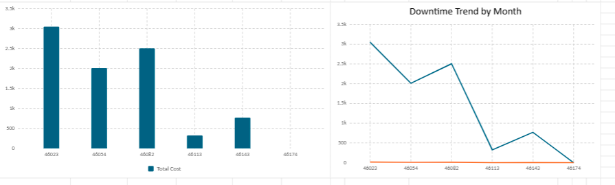
Monitoring Maintenance Costs with Greater Precision
Maintenance costs rarely increase suddenly. They usually grow through repetitive emergency repairs, spare-parts replacement, subcontracting expenses, overtime interventions and production interruptions. Without structured monitoring, these costs remain dispersed and difficult to interpret.
The Excel dashboard centralizes cost information in one place. Each intervention can include labour cost, spare-parts cost, external service cost and additional expenses. This structure helps organizations understand not only how much maintenance costs, but also where the money is being spent.
Equipment Availability: A Central Maintenance Indicator
Availability measures how much time a machine remains ready for use compared with its planned operating time. In industrial environments, this indicator is essential because production capacity depends directly on equipment readiness.
Availability Rate = Operating Time ÷ Total Available Time × 100
When availability decreases, the dashboard helps determine whether the problem comes from frequent breakdowns, long repair times, delayed spare parts, poor preventive planning or aging equipment. This indicator is particularly useful during production reviews because it connects maintenance performance directly to operational output.
Understanding Downtime and Intervention Duration
Downtime represents the period during which equipment is unavailable. It may be caused by breakdowns, inspections, part replacements, adjustments, waiting time or external service delays. Tracking downtime accurately helps teams understand the real impact of maintenance on operations.
Intervention duration also provides valuable insight. A long intervention may indicate technical complexity, lack of spare parts, insufficient documentation or repeated diagnostic difficulties. Over time, this data helps improve maintenance procedures and team organization.
Preventive Maintenance Versus Corrective Maintenance
A good dashboard separates preventive and corrective maintenance. This distinction is essential. Preventive maintenance is planned in advance to reduce breakdown risk, while corrective maintenance happens after a failure has occurred.
When corrective maintenance dominates the dashboard, the organization is probably operating under pressure. Emergency interventions become frequent, technicians lose control over planning, and maintenance budgets become harder to stabilize.
When preventive maintenance becomes stronger, the maintenance rhythm becomes more predictable. Teams can plan spare parts, schedule technicians, reduce production interruptions and improve asset reliability.
Key Maintenance Indicators Included in the Dashboard
MTBF – Mean Time Between Failures
MTBF evaluates the average operating time between failures. It is one of the most useful indicators for measuring equipment reliability.
MTBF = Total Operating Time ÷ Number of Failures
A rising MTBF generally indicates that equipment is becoming more reliable. A falling MTBF may show that failures are becoming more frequent and that preventive maintenance requires adjustment.
MTTR – Mean Time To Repair
MTTR measures the average time required to repair equipment after a failure. It reflects the efficiency of maintenance intervention, diagnosis, spare-parts availability and technical organization.
MTTR = Total Repair Time ÷ Number of Failures
A lower MTTR usually indicates faster repair processes. A rising MTTR may reveal insufficient documentation, unavailable parts, complex breakdowns or overloaded maintenance teams.
Failure Rate
Failure rate measures how frequently equipment breaks down during a given operating period. It helps identify assets that require special attention.
Failure Rate = Number of Failures ÷ Operating Time × 1000
When a machine displays a high failure rate compared with similar equipment, the dashboard provides a strong basis for technical review, replacement analysis or root-cause investigation.
How the Dashboard Supports Monthly Reporting
Maintenance managers often need to present monthly results to production managers, financial departments or general management. A dashboard simplifies this reporting work by providing ready-to-read indicators.
Instead of preparing reports manually from scattered notes, the manager can use dashboard charts, cost summaries, intervention statistics and availability trends. This improves communication between technical teams and decision-makers.
Typical monthly dashboard outputs
- Total maintenance cost for the month.
- Top five machines by downtime.
- Preventive versus corrective maintenance ratio.
- Average intervention duration.
- Availability rate by equipment family.
- Recurring breakdowns requiring root-cause analysis.
A Flexible Model Adapted to Different Sectors
The maintenance dashboard can be adapted to many operational environments. In manufacturing, it can monitor production equipment. In logistics, it can follow conveyors, forklifts and loading systems. In facility management, it can track HVAC, elevators, electrical installations and technical assets.
The same logic can also support hospitals, workshops, hotels, industrial sites, energy installations, schools, technical buildings and fleet management activities. Each organization can adapt equipment categories, cost centers, intervention types and reporting periods.
Final Perspective
Maintenance performance rarely improves through intuition alone. Sustainable improvement begins with visibility. When organizations monitor maintenance costs, equipment availability, downtime, intervention duration and reliability indicators consistently, decision-making becomes clearer and more strategic.
Rather than functioning as a simple spreadsheet, the maintenance dashboard becomes an operational reference point. It reveals recurring weaknesses, supports preventive planning, reduces unnecessary downtime and strengthens long-term equipment reliability.